'What have you learned from your audience feedback?'
introduction

|

|

|

|
|
methods used & why

|
Whatsapp is a messenger app in which people can connect with family and friends around the world. This app includes a subscription service and is available to many smartphone devices and is also available on many android and apple gadgets. Most importantly, you can send and receive images, videos, voice messages and can also video call. Therefore, I have used this app to send my media products around to my family and friends to obtain audience feedback.
|

|
Twitter is an online social networking service in which people from all over the world can connect with each other simply by a touch of a button. Twitter users can send and receive tweets and can upload images and videos. This social networking site can also be accessed via the app as its widely available to both android and apple users, and also via the internet. I have used Twitter to connect with my followers to share my media products and obtain their opinions of my work.
|

|
Instagram is also an online social networking service in which people all over the world can share images, and videos with each other. Instagram users can also send and receive instagram direct messages. This social networking site can be accessed by its users online or via the app. I have used instagram to collect audience research using direct messaging.
|
|
|
Youtube is an online video streaming site. Users can upload videos, stream live and subscribe to other users channels. They can also like and comment on other users videos. Therefore, I have used Youtube to share my trailer so other users can like and comment on the video and also subscribe. Youtube is also useful for viewing my videos statistics of who has watched the video in terms of location etc.
|

|
Snapchat is a social media app in which users can take pictures and videos or upload them from their galleries. Users can also connect with people around the world by 'snapping' them either by messaging or an image. In this case, I have used snapchat to send my trailer, poster and magazine to my friends, i then received their feedback.
|
|
I have used survey monkey to collect feedback which will then be constructed into graphs which is easier to view and understand as it will include graphs.
|

|
To collect more reliable and interesting audience feedback in a different form, i have also decided to record face to face interviews which would involve me asking my audience about my media products and what they think. I have also used the camera to record reaction videos. This method is useful as it portrays a visual response of how my audience reacted and I can also break down any questions they may have further to develop their understanding.
|
'WHAT Have you learned from your audience feedback?'
MAGAZINE FRONT COVER
A horror magazine should be very eye catching for the audience, which is fans of the horror genre. It should also stand out to them and make them want to purchase it. There should be a variety of things that the audience should notice when they look at the front cover of our magazine.

|
|
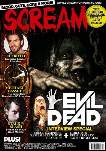
INSPIRATION
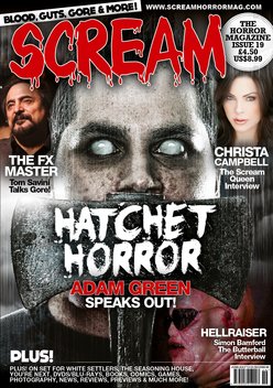
We took inspiration for our magazine from an edition of the 'Scream' magazine about hatchet horror. There are similarities in the selling line at the very top of the page, the positioning of the masthead and the cover lines at the bottom of the page. Also, the two main images stand out very much, even though the positioning of my one is slightly to the right. The main cover lines link to the whole of the magazine itself, as the existing horror magazine says hatchet horror on a hatchet and the enthrallment main cover line on our magazine is the name of our film, showing continuity between our magazine and our trailer.
These are the 10 questions we asked on our survey of our magazine:
|
1. What is the first thing that stands out on our magazine?
Main Image Masthead Main Cover Line Cover Lines |
6. What would be the main reason in you buying this product?
Looks good To find out more about what is inside it Fan of the horror genre |
|
2. Do you think that the choice of masthead 'Pandemonium' works well with the magazine?
Yes No |
7. Do you feel that the typography/fonts used on our magazine works well with the horror genre?
Yes No |
|
3. Do you think that the colour scheme of green, white and black works well on our magazine?
Yes No |
8. Is the main image eye-catching?
Yes No |
|
4. Would you purchase this magazine if you saw it in a shop?
Yes No |
9. Do you think that our magazine fits the conventions of an existing horror magazine?
Yes No |
|
5. If Yes, how much would you be willing to spend on it?
Less than £1 £1 - £3 £3 + |
10. Does our magazine link with the trailer and poster?
Yes No |
magazine evaluation
I have gained valuable and critical feedback from the audience, seen from the results of the survey. I can see that the main image on the front cover stands out as 75% of the audience were drawn to it, whereas the masthead was the first thing that stood out to only 15% of the audience, and just 10% were drawn to the main cover line first. Overall, I feel that it was the right choice to use the word 'Pandemonium' as the masthead, and 85% of those who took part of the survey agree, whereas 15% disagree. The majority feel that the colour scheme of green, white and black worked well on the magazine, with 15 of the 20 surveyed believing this to be true. Some people said that they would not purchase this magazine if they saw it in a shop, which suggests that we still need to appeal to a wider audience in order to get more people to enjoy our products. However, 75% would purchase it, suggesting that it could be quite a success if it was to be sold in shops. Of those who said they wold buy it, most of them would pay a reasonable price of between £1 and £3 for it. Some would pay less than £1 for it, while others would pay more than £3 for it due to the high quality of it. The main reason given for wanting to buy this product is that it looks good, with over 50% of participants stating this. Others want to find out more about what is inside it, and some are a fan of the horror genre, meaning they would purchase it because they enjoy all things horror. 85% said that the typography works well with the horror genre, while 15% believe otherwise. 90% said that the image was eye-catching, making this question have the most definitive answer than the rest. 70% believe that our magazine fits the conventions of an existing horror magazine, whilst 30% do not. Finally, 65% of people feel that there is continuity between the magazine, poster and trailer, and 35% do not. These statistics show that overall, the magazine was successful as the majority of answers given by the audience were positive ones, with only a few negative answers.
By Sam
Teaser trailer
Our synopsis
'Susan starts to become suspicious of her sister Lily after hearing some weird chanting coming from her room late at night. Lily's always been a unique girl but even by Susan's standards this is a bit weird. So she grabs her phone and decides to investigate, what she finds leaves her shocked and it's a race against time for survival'
Inspiration
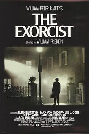
Our trailer takes a lot of inspiration from films such as 'The Shining' and 'The Exorcist'. We didn't have a lot of money to use many different large locations so we liked the idea of those films as we also wanted to get as much mileage out of a single and small location as we could. Also the supernatural psychological aspects were very interesting to us.
|
|
|
|
These are the 10 questions we asked
|
1. Did the narrative make sense?
Yes No 2. Was the Sound effective in building suspense?
Yes No 3. Does the trailer fit the Supernatural sub genre?
Yes No 4. Could you identify the protagonist and antagonist?
Yes No 5. Does the trailer give too much away?
Yes No |
6. Does the trailer make you wanna see the film?
Yes No 7. Do you think our trailer is professional?
Yes No 8. Does slow paced trailer build suspense?
Yes No 9. Is the trailer predictable?
Yes No 10. Was the montage at the end exciting?
Yes No |
|
|
Youtube
|

|
iMessage
|
trailer evaluation
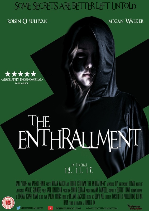
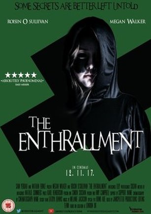
horror poster
|
|
|
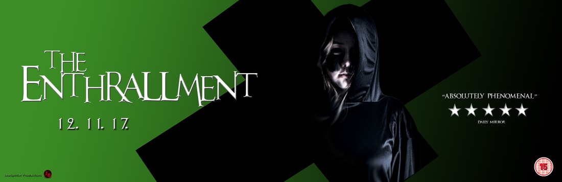
Inspirations
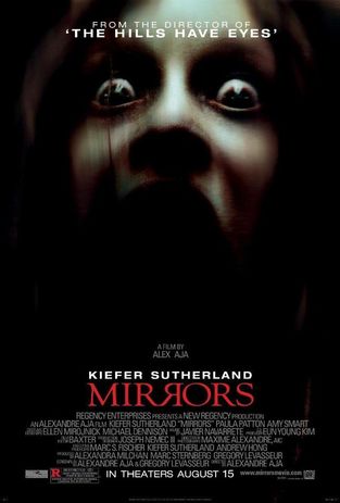
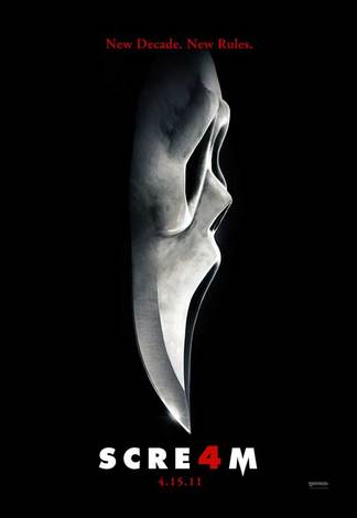
A lot of inspiration was garnered from Mirrors and Scream due to the way they used the effects of darkness to blend in the picture with the background, and especially with Mirrors and how they managed to use the low-key lighting to illuminate certain elements of the face, but hide others. Our colour scheme and mise-en-scene were also inspired by Scream, as the gown that Ghost Face wore was very iconic, and the way the poster's masthead stood out against the black background was eye-catching, so we wished to use that for our poster also.
These were the 10 questions asked on the survey.
|
1) Is the person on the poster eye-catching?
Yes No 2) Is the tag-line "Some Secrets Are Better Left Untold" catchy?
Yes No 3) Does the Green/Black/White colour scheme attract you to the poster?
Yes No 4) Do you think the font on the poster would be associated with a horror movie?
Yes No 5) Is there anything on the poster that particularly caught your eye?
Colour Scheme Title Tag Line Main Image Movie Rating |
6) Do you think the poster resembles, or is similar to, real movie posters?
Yes No 7) From 1-5 what would you rate this poster?
1 / 2 / 3 / 4 / 5 8) Does the poster entice you to go to the cinema and actually watch the movie?
Yes No 9) What kind of feeling does the poster bring out inside of you?
Sadness Anger Happiness Emptiness Excitement 10) Does the poster link to the trailer in any way?
Yes No |
Here are some responses we received from the audience on out poster, via survey monkey
These are responses from our audience, via social media
by nathan
|
|
|
poster evaluation
I've gained invaluable data from surveying our audience. It is incredible to see that 86% of the audience that answered the first question were drawn to the masthead. 81% said that the tag line is catchy, which is good because it means that it is in line with the way really horror posters have created their tag lines. When asked if the colour scheme was appealing 62% said yes, and 38% said no. This was expected, as it does challenge the typical convention of horror colour schemes consisting of the colours red, black and white. When asked if the typography was associated with that of a horror poster 91% of the audience replied yes, strongly confirming our belief in the usage of the font and the fact that it followed horror conventions. When asked if there was anything that caught their eyes, the audience responded that it was the main image. The dominant image was the most worked-on convention on the poster, many hours of effort and constant editing and manipulation of software were put in, so to see that it has paid off and the audience are particularly captivates by it is a true testament to the conventions similarity to a real horror convention. 91% of the audience stated that the poster is similar to that of a real horror poster, only cementing previously collected data that encouraged the idea of our poster being similar. When asked to rate our poster out of 5 stars 85% rated it 4/5 stars, which also particularly re-enforces our belief that our poster follows horror poster conventions, as the audience are practically stating that it is almost authentic and could be considered to be a real horror poster. 80% of the people surveyed responded yes when asked if they would go see the movie after analysing this poster. However, as much as there are positives to the poster, there are also flaws as 40% of the people surveyed said that they did not believe the green/black/white was an appealing colour palette for our poster, most likely because of the green which is particularly unconventional. Another thing that could be improved upon when analysing the poster is the billing block, as the titles of the jobs assigned to the production team were not properly blocked. However, over all it is assuring to say that this poster was on overall success.
The reason we have two sections to our Question 3 Evaluation is because initially Latoya was working separately from our group but we joined together again and combined our work. Also, we asked different questions so we had to do it this way.
OUR MEDIA PRODUCTS
tHE poster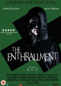
|
the MAGAZINE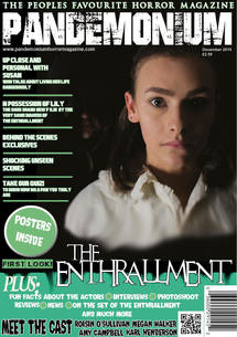
|
the teaser trailer
POSTER -
|
|
|
10 questions i asked:
|
Question One
1. Do you feel that the main character is portrayed effectively on the poster? Yes No Question Two 2. Do you think the tag-line "Some Secrets Are Better Left Untold" is effective? Yes No Question Three 3. Do you think the lighting used is best suited for the genre of horror? Yes No Question Four 4. Does the colours green, black and white attract you to the poster? Yes No Question Five 5. What is the first thing you notice about the poster? Main Image Title Tag-Line Colours |
Question Six
6. Do you feel that the poster is similar to the trailer? Yes No Question Seven 7. Do you think that my poster looks similar to other horror film posters? Yes No Question Eight 8. Can you state any advantages and disadvantages of the poster? Question Nine 9. What was your favourite element of the poster? Question Ten 10. Does the poster encourage you to watch the film in the cinemas? Yes No |
The RESULTS

|
Participants aged 15 - 25 were asked 10 questions based on the poster using WhatsApp. Their responses are displayed below:
|

|
Participants aged 15 - 25 were asked 10 questions based on the poster using Instagram. Their responses are displayed below:
|

|
Participants aged 15 - 25 were asked 10 questions based on the poster using Snapchat. Their responses are displayed below:
|
|
|
|
|

|
I ran a Twitter Poll in which i asked my followers 10 questions based on the poster. The results of the poll are displayed below.
|

|
Participants aged 15 - 25 were asked 10 questions based on the poster using Survey Monkey. Their responses are displayed below along with graphs:
|
TRAILER -
|
|
|
10 questions i asked
|
Question One
1. Are the title slates/captions effective when understanding what is going on in the trailer? Yes No Question Two 2. Does the sound help to create suspense? Yes No Question Three 3. Do you feel that our teaser trailer gives too much away? Yes No Question Four 4. Does the pace of the trailer build tension? Yes No Question Five 5. What sub-genre do you think our trailer represents? Slasher Supernatural/psychological J- Horror Zombie Splatter |
Question Six
6. Do you feel that the poster is similar to the trailer? Yes No Question Seven 7. From our trailer, could you identify the good and bad characters? Yes No Question Eight 8. Can you state any advantages and disadvantages of the trailer? Question Nine 9. Did you find the trailer scary or jumpy? Yes No Question Ten 10. Does the teaser trailer encourage you to watch the actual movie in the cinemas? Yes No |
The Results

|
Participants aged 15 - 25 were asked 10 questions based on the trailer using WhatsApp. Their responses are displayed below:
|

|
Participants aged 15 - 25 were asked 10 questions based on the trailer using Instagram. Their responses are displayed below:
|

|
Participants aged 15 - 25 were asked 10 questions based on the trailer using Snapchat. Their responses are displayed below:
|

|
I ran a Twitter Poll in which i asked my followers 10 questions based on the trailer. The results of the poll are displayed below.
|
From the results obtained shown above, i found that most people felt that our teaser trailer didn't give too much away, however 17% of people felt that it did. Therefore, in order to meet the expectations of the 17% of people who said yes, we could have taken some parts out. We also found that the sound used in our trailer was really effective as the results showed that everyone felt that the sound helped build suspense. In contrast, 40% of people felt that the pace of the trailer didn't build tension whereas, 60% felt that it did. This suggests to us that we should have sped some areas of our trailer and used more stock scenes to meet the expectations of our audience.
From the results, we found that most people felt that our teaser trailer is similar to other horror teaser trailers. However, 33% of people said that it wasn't. In order to meet their expectations we could do more research and include more horror movie conventions in our trailer, such as more codes and conventions which suggest horror. We also found that everyone who took part could easily identify the good and bad characters (protagonists and antagonists).
From the results, we found that most people felt that our teaser trailer is similar to other horror teaser trailers. However, 33% of people said that it wasn't. In order to meet their expectations we could do more research and include more horror movie conventions in our trailer, such as more codes and conventions which suggest horror. We also found that everyone who took part could easily identify the good and bad characters (protagonists and antagonists).
|
|
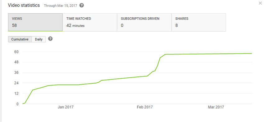
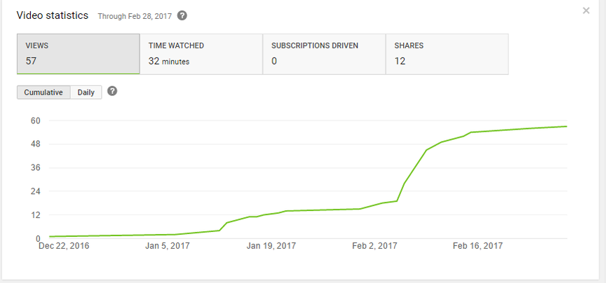
We have used YouTube to share our trailer with our target audience. We can also use YouTube to display the statistics of our trailer, for example; how many views it has etc.
|
|
|
In the images above, shows two different screenshots from our trailer and its statistics. The reason we have two screenshots is because our trailer was posted onto two of our accounts.Overall, our trailer has been viewed 115 times, and has been watched for 74 minutes. This also shows that our views have increased over time.

|
I used a camera to record reaction videos of the trailer
|

|
Participants aged 15 - 25 were asked 10 questions based on the trailer using Survey Monkey. Their responses are displayed below along with graphs:
|
MAGAZINE -
|
|
|
10 questions i asked -
|
Question One
1. Do you feel that the main characters are portrayed effectively on the Magazine? Yes No Question Two 2. Do you think the magazine is well structured terms of sizing and positioning etc.? Yes No Question Three 3. Do you think the lighting used is best suited for the genre of horror? Yes No Question Four 4. Does the colours green, black and white attract you to the Magazine? Yes No Question Five 5. What is the first thing you notice about the Magazine? Main Image Title of our film Typography Colours |
Question Six
6. Do you feel that the Magazine is similar to the trailer & poster? Yes No Question Seven 7. Would you buy this magazine if you saw it in the shops? Yes No Question Eight 8. Can you state any advantages and disadvantages of the Magazine? Question Nine 9. What was your favourite element of the Magazine? Question Ten 10. How much would you be willing to pay for the magazine? £0-£1.50 £1.50-£3 £3+ |
THE RESULTS

|
Participants aged 15 - 25 were asked 10 questions based on the magazine using WhatsApp. Their responses are displayed below
|

|
Participants aged 15 - 25 were asked 10 questions based on the trailer using Instagram. Their responses are displayed below:
|

|
Participants aged 15 - 25 were asked 10 questions based on the trailer using Snapchat. Their responses are displayed below:
|

|
I ran a Twitter Poll in which i asked my followers 10 questions based on the trailer. The results of the poll are displayed below.
|

|
Participants aged 15 - 25 were asked 10 questions based on the trailer using Survey Monkey. Their responses are displayed below along with graphs:
|
By Sam
Conclusion
Looking at the feedback that we received back there were a few alterations that could be made to our media products.
For our trailer we could have portrayed our main characters slightly better. This would be important to us as unlike a slasher film we don't have many stock characters so the few characters we have are quite important to our narrative.
For our Poster we could have used a different tagline as it seems that while it did elicit the correct emotion in those that looked at the Poster it wasn't necessarily memorable.
There isn't much to be changed from the feedback we were given for the magazine. Initially we were thinking of selling the magazine for approx $1 but it seems we could raise the price due to the higher quality of the product we have created.
