In what ways does your media production use, develop or challenge forms & conventions of real media products?
WHAT ARE CONVENTIONS?
Every forms of media will follow a number of different recurring traits or rules that are known as conventions. It's these conventions that will make a genre of media text recognizable e.g. lowkey lighting in a horror film. In our production we chose to include, follow or challenge many of the conventions that can be seen in the horror genre for trailers, posters and magazines.
Trailer Conventions
By Sam
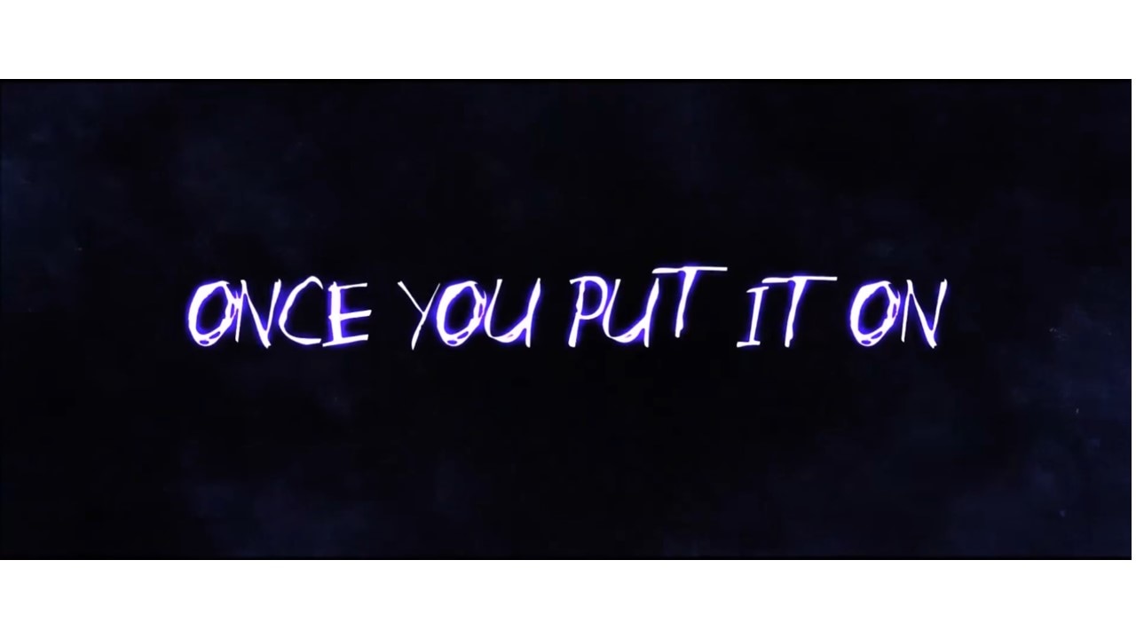
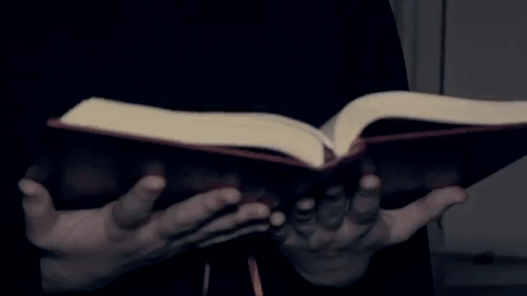
Title SLates
Title slates are very important in setting the scene to a trailer and giving the viewer an expositional aspect of what is going on in the film. Their aim is to tell the story of the film in a literal sense but without giving away too much information. They can also add to the scare factor of the trailer.
Real Media Text Examples
Conjuring - Official Trailer
|
Annabelle - Official Trailer
|
Clown - Official Trailer
|
What we found from real media text examples:
- We found that most horror trailers will choose to put their text in a light colour such as white against a dark background as this makes the text contrast and pop more on screen.
- We found that trailers wont use static text on the screen but will usually have the text appear on screen in a way that would be appropriate to the film or sub-genre.
Our Trailer
|
|
- We decided to follow the conventions of title slates in our horror trailer. We decided that the use of text would help us to tell the story of the overall movie in our trailer however we chose to minimize the number of title slates as we felt that the visuals for our teaser trailer were strong enough to tell the story without an immense amount of text to accompany it.
- We used a simple font to make sure that it was easy for the viewer to read quickly when appearing on screen and to not complicate the screen. We also made sure that our text was the same text that was used in our trailer to create a sense of brand.
- We also made sure that like the Real Media Text examples that's the text had an effect when coming on screen. To follow the supernatural sub genre we chose for the text to have a glow and appear out of thin air on screen.
Editing
|
|
Editing is extremely important as it's the cohesive way that the trailer goes together. the different way that shots are strung together and the effects can have different effects on the audience such as scaring them more. Also a stylistic style of editing can make the trailer more unique to others.
Fast Paced Montage
This part of the trailer is at the end when a number of characters have been established and a disequilibrium has been established. At this point the trailer becomes very fast paced and sense of chaos is connoted through fast cuts and quick camera movement. It's this part of the trailer that reveals to the audience the existence of more dreadful scenes and most heavily connotes the horror genre. This part of the trailer will usually take place in the last third of a trailer and is the most exciting part for audiences which really attracts them to go and see the film.
Real media Text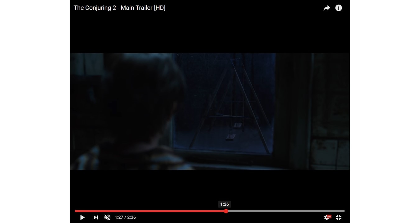
A fast paced montage has been used starting at approximately 1:26. This is around the halfway point to the last third of the trailer so it follows the usual convention. From this point onward the scenes cut faster and faster and the transitions become quicker until the climax of the trailer
|
Our Trailer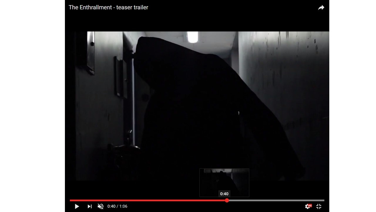
The fast paced montage of the trailer starts at around the 0:40 mark which is in the last third of the trailer and follows the usual convention for a fast paced montage. the use of cut to black instead of fades and the use of heart beats and ascending tones gives a sense of excitement and angst to the climax of the trailer.
|
Types Of Transition by Nathan
In a horror trailer there are a few main methods that you will use to move between shots.
Cut to BlackThe cut to black is a technique which helps to ad emphasis to what happens on screen. This is extremely helpful in horror as the sudden cut to black can help to add effect to a loud noise or quick movement on screen but stop before too much is given away. The Cut to Black is also very useful in montage. It helps to give a choppy stop-start effect to quick shifts between many shots and when coupled with the correct timing on sound it can be very effective in scaring an audience and giving them further incentive to see the film. We chose to follow this convention of trailers and used many cuts to black in our trailer when during jump scares to help emphasize them and in our fast paced montage.
|
|
Fade to blackThe fade to black is a type of dissolve that moves from a shot to a black screen. This is a slower transition which is about a takes about about half a second and helps better for a build up of scenes. This transition would be useful when setting up an equilibrium at the start of the trailer and then working it's way through the title slates to the disequilibrium of the trailer. The trailer once having the problem established will move into the fast paced montage section and where cuts to black are more prominent.
|
|
Narrative Structure by nathan
3 act structure (Todorov)
Real Media TextIn this example of a horror trailer the 3 act structure is followed. The equilibrium is shown at the beginning of the trailer followed by the disequilibrium and quite unusually the resolution is seen in the trailer.
|
Our TrailerWe chose to follow part of the three act structure for our trailer but we had to challenge some aspects of the narrative structure to make our trailer more effective. We included the equilibrium and disequilibrium in our trailer however as it is a trailer and not a full feature length film. We had to eject a resolution as it would give away the way the film ends and there would be no incentive to see the film. The resolution was replaced with a fast paced montage which excites the audience and gives
|
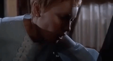
Characters
Characters are very important in any production. They are the instruments used to put together a story. The different personality traits, agendas and interactions between the characters cause this story to take place.
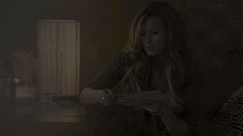
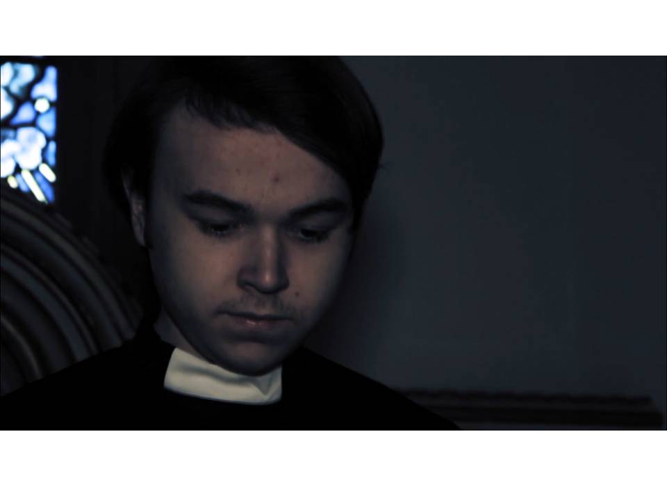
Protagonist: Our protagonist followed the convention of a male hero that helps solve the disequilibrium and is the cause for the resolution. Our character is a priest that is meant to connote the pure side of the binary opposition.
Antagonist: We have a female for an antagonist which isn't very common among the high grossing Real media text examples. So we have challenged the convention of antagonists being mainly male and chose that we would take a female that becomes possessed and takes on certain masculine qualities which makes her more imposing on the protagonists. Our antagonist represents the dark or impure side of our binary opposition.
|
|
|
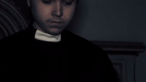
The priest is a character that represents the pure nature of humans. He wears a priest outfit which is heavily tied to the christian religion. As the main protagonist he shows direct opposition to the darkness in the film which is connoted through our antagonist.
|
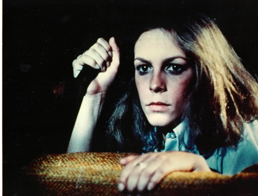
Laurie Strode is a female protagonist that in the post modern era represents a feminist viewpoint in horror. She wears clothes that don't show much skin as to challenge the male gaze. She then brandishes a knife (phallic object) of her own that she uses to fight back against the male protagonist
|
How & why we used the characters
By Latoya
PROTAGONIST
|
|
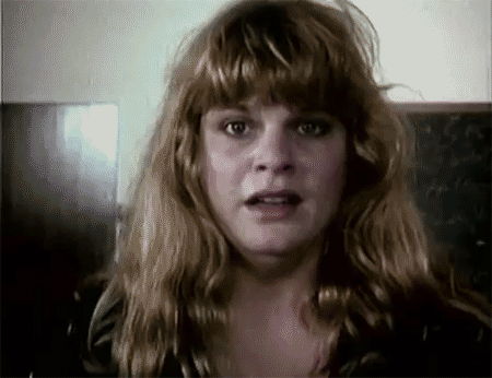
As shown above, the protagonist is shown to have certain expressions on their faces which denote fear. we have used this convention in our trailer to enforce a atmosphere of tension and suspense as the audience are not aware of what is going to happen next as they can only see the facial expression of the characters. this convention is useful in horror movie trailers as it impacts on the audience and plays on their fears - which horror movies are designed to do.
ANTAGONIST

|
|
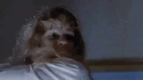
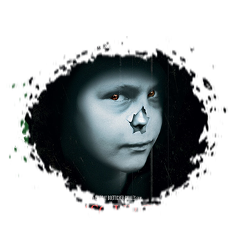
As shown above the antagonist in our trailer it is hard to see our antagonist clearly, this is also shown in the example from a real media text, therefore, we have used a typical convention in horror movie trailers. This is useful to stop our audience from seeing too much of the film which would spoil the entire plot - which would then result in them not viewing the film.
LIGHTING
By Latoya
|
|
As shown above, Real Media Texts tend to use low-key lighting which is also shown in our trailer. This is a typical convention used within horror movies and trailers especially in supernatural horror movies as it suggests that there is a dark, evil atmosphere which connotes to the audience that something bad is going to happen. This convention helps to set the tone very well as it brings a sense of enigma and mystery. The use of low-key lighting also builds a sense of suspense as the audience aren't aware of what is going to happen. The reason why we have shown an example from our trailer and a Real Media Text is to show how we have used conventions from Real Media Texts within our own trailer to build a certain atmosphere for our audience so it is more conventional as a horror movie trailer.
COSTUME
By Latoya
|
|
As shown above, from the example from our trailer, we have dressed this character in a priest costume as it is appropriate and conventional due to the plot of our trailer. As shown in the real media text, the character who portrays the mother is dressed in a long gown, with pearl earrings, also with her hair done in a certain style to denote that she plays the mother character. Costume is key in terms of how conventional a trailer is as it portrays in the characters in certain ways to demonstrate a certain idea to its audience. Therefore, we dressed Karl in a priest costume to portray that he is holy and will save or rid the possessed spirit. We used this typical convention of horror movies.
Camera Techniques
by latoya
|
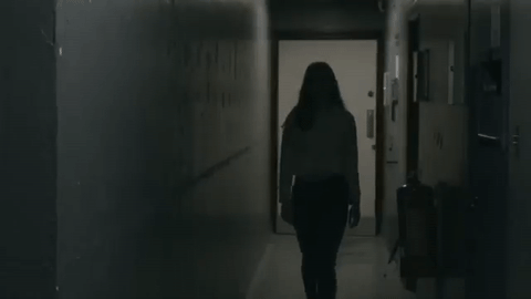
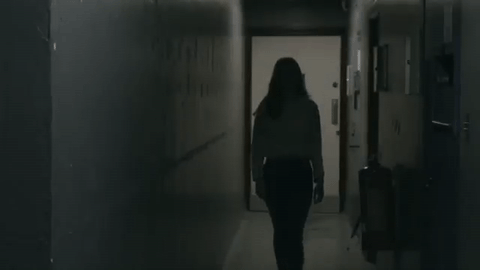
Long Shot - When filming this scene we set up a tripod and placed the camera on it to film the long shot of our character walking towards the room. This is useful as it allows the audience to see the location better and what our character is wearing. This helps to build the atmosphere of tension and suspense - in which this convention is typically used in horror films, therefore, we decided to use it as well.
|
|
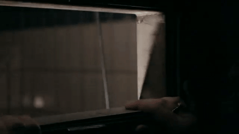
Wide Angle - When filming this scene we used the camera to construct this wide angle to help show that our character is looking at something. This helps to build tension and create a visceral or emotional pleasure for our audience. (Altman)
|
|
|
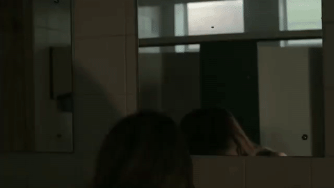
Over The Shoulder Shot - This is a useful convention which is typically used in horror movie trailers as it builds tension and suspense. This also creates an atmosphere of dramatic irony as the character isn't aware of what is behind her. We have used this as it is a typical convention and because of the impact it has on its audience.
|
|
Low Angle Shot -This shot is useful as it makes this character seem more powerful to our audience. This isn't always used in horror movies but we decided to challenge the typical conventions and use one that isn't typically used to add even more suspense.
|

|
|
Close Up - this is a useful convention as it allows the audience to see the characters full expressions. This is typical therefore we decided to use this.
|
poster
by Latoya and Nathan
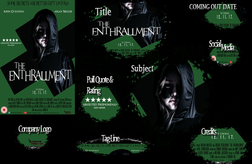
OUR POSTER |
REAL MEDIA TEXTS |
|
|
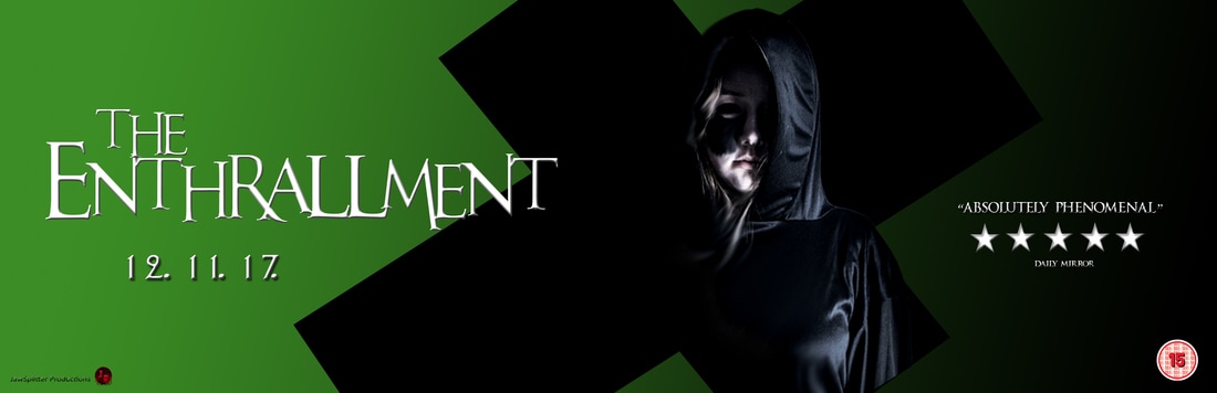
Our posters conventions: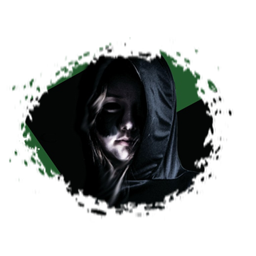
For the main image we decided to follow some of the conventions a real horror would have. For instance, the lighting of the main image is very low-key, a trait common among main images as it is used to place a dark, scary mystique over the poster. The lighting is effective, because it hides the antagonist's face slightly. We chose to be slightly out-of-the-box in the way the image is placed in the screen - there is a cross that is placed on the background using Adobe Photoshop, and the image of the antagonist is placed as if the person is phasing through the object. Due to the fact that the subgenre of the poster is supernatural, the subliminal message could be interpreted as the battle between religion and witchcraft, and the fact that the main image is coming through the cross could mean that religion has been used as a means to empower witchcraft.
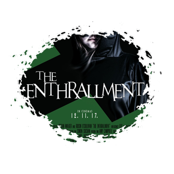
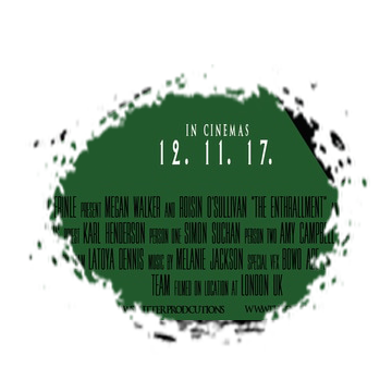
The title is a vital convention of posters, therefore we had to use it as it is a key marketing and advertising tool which allows our target market to find out about our film. If i target market and audience know the title of our film then they were able to find out even more information. The Title convention tends to have a specific font and is the biggest text on the poster so it is easily noticeable by our target market and audience.
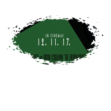
The release date is also an important convention of horror movie posters as they allow the audience to be aware of when the movie is coming out. This is beneficial for them as they are fully prepared for when the movie is being released in their country/region. As movies have different releases dates in different countries/regions, its important that this date is advertised on the poster specifically for the country or region. 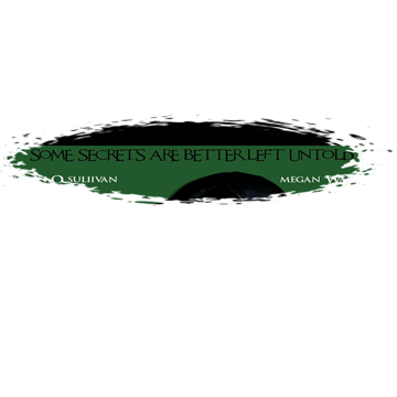
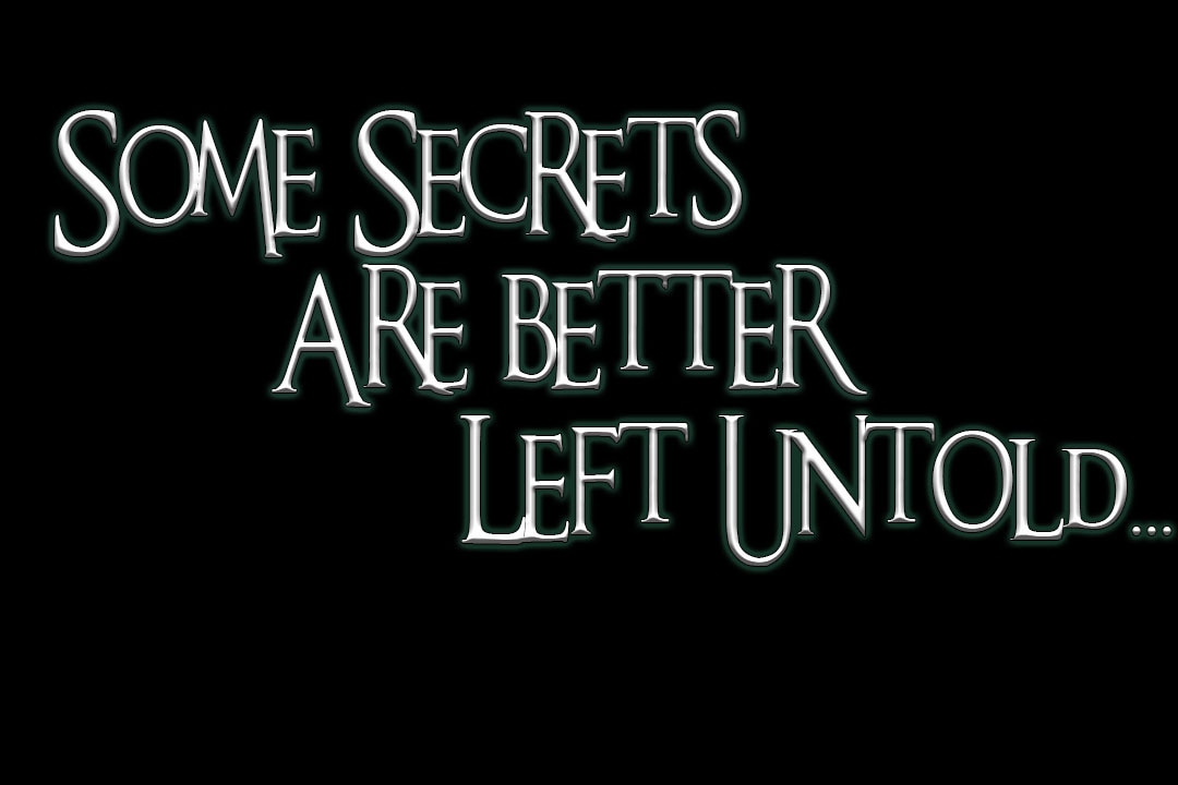
The use of a tagline is not fundamental however, it does serve a purpose of giving the audience insight of what the movie is about. This is useful as this will spark their interests and maybe encourage them to watch the trailer and even the movie. Our tagline is " some secrets are better left untold" this is useful as the audience will automatically know that our movie has a deeper meaning involving secrets.
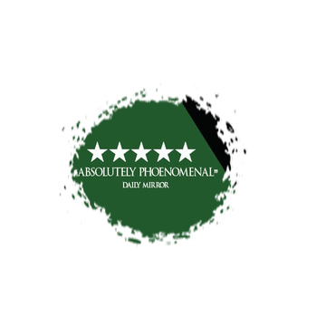
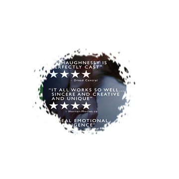
The pull quote and rating is also not a fundamental or required convention of posters as not all horror movie posters have them, although it does serve a purpose. The purpose it serves is by allowing the audience to know that the ratings it has obtained which would encourage them to potentially see the movie. Our horror movie obtained 5 stars from Daily mirror, therefore, people would be even more encouraged to see our film. Whereas, if we had received a poorer rating, our sales would have been low.
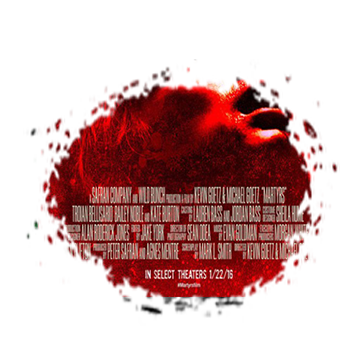
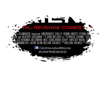
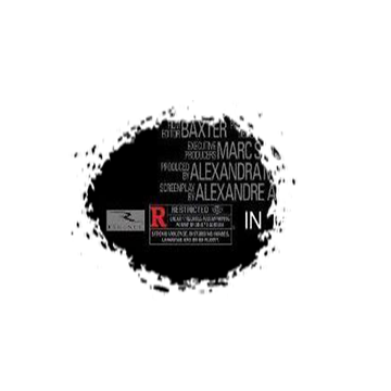
The credits are an essential convention of all posters. This is required by law, therefore it is important that we included this on our poster. This convention also serves a purpose which is beneficial for our audience. For example, it allows our audience to know the production company of our film and who stars. This can boost our sales as our audience may be familiar with the production companies or stars.
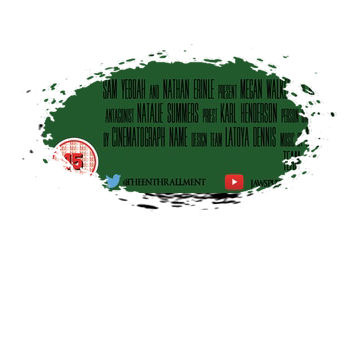
In recent times, using social media links on horror movie posters has been significant. Therefore, we decided to include this on our poster. This is beneficial for our audience as they can find us on social media and find out more about the release dates, tickets, stars etc. This convention is important especially for those who may only catch a glimpse of the poster therefore they could use our social media links to find out more information.
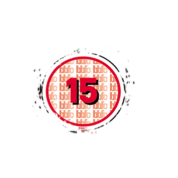
The certificate is an important convention of horror movie posters. It is a way of regulation by controlling and protecting those who need it from inappropriate content not suited for them.
|
|
house style
by nathan
The main purpose of a house style is to ensure consistency. House style enhances the 'brand image' of the company, and becomes what the audience of the movie franchise finds most noticeable and memorable.
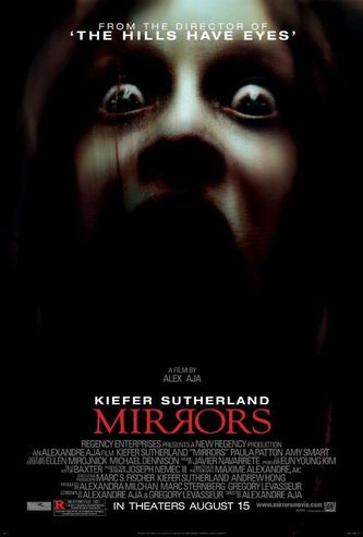
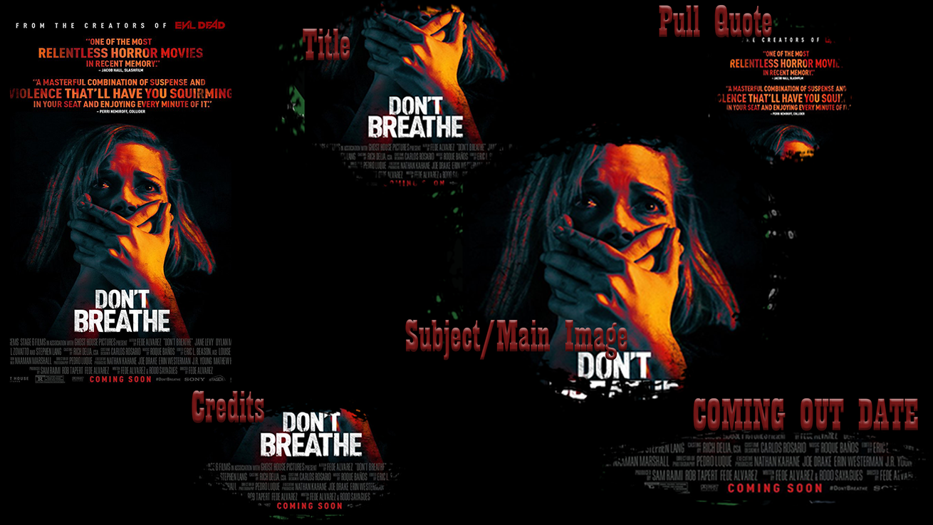
This RMT has followed the conventions of a horror poster wisely. The house style is a very common one with the usage of the colours red, white and black - using a black background to create a contrast between it and the red & white font used. the biggest font used, which is the movie title, was typed in red, supported by the secondary font colour - white. Due to the fact that the red font is surrounded by the white, it helps draw the audience's attention towards the title and quickly cement the name of the movie in the audience's minds. The only other use of red on the poster is in the age certificate so that it is clearly evident that the movie is rated 'R'. The rest of the font is white.
|
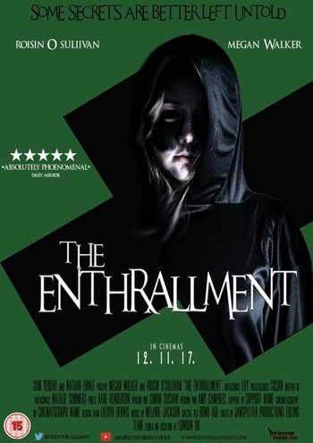
In our trailer, we chose to stay conventional and stick to three colours: green/ black for the background and white and black for the font. These conventions were used effectively as the white was used for the title, so that it could effectively stand out against the black cross and dark main image. The black font was used for the billing block, as it wasn't the most necessarily aesthetically appealing convention of the poster, and would consequentially not be looked at as much as others. It was imperative that we used the white font for the release date, as it is an important convention that lets the audience know exactly when the movie will be released. The tag line at the top of the poster was typed in a black font, because even though it holds the iconic catchphrase of the movie, it is usually presented not surrounded by other conventions, and is large enough to be spotted out quickly.
|
This RMT has also followed conventions of a horror poster house style: it has a white background, with black and red font. The red font is used to make the name of the leading actress in the movie stand out more than most of the text. This could be partly promotional, as the movie could be slightly low-budget and could by trying to use the famous actress' star-power to help boost the recognition of the movie to appeal to other audiences that would not usually watch this genre, but would mainly watch the actress. The main font is black, used to directly contrast against the white background. This could connote some form of binary opposition in the movie itself through the used of black/white light/dark contrasts.
|
Magazine
Masthead - The masthead is the title of the magazine, which is typically in block writing. It is like this so that it is recognisable and distinctive to the audience when they first see it. It should be one of the first things they notice. The masthead can sometimes be designed in a particular in order to match the genre of the magazine. It is conventionally at the top of the magazine, either at the very top or just below the strap line.
Main Image - The main image of the magazine is distinctive to the audience and stands out when they first look at it. It should be big and cover lots of the front cover. It should be one of the first things they notice. The main image on the front cover of a magazine is conventionally in the centre of the page, although it can sometimes be placed on the right or left of the page.
Main Cover Line - The main cover line is what story the magazine is focusing on. It is related to the main image seen on the front cover. It is sometimes what attracts the audience to the magazine, due to the use of bold, colourful or distinctive writing.
Strap Line / Selling Line - This is a line of text, usually found at the top of a magazine, but is sometimes in other places on the front cover as well, such as directly below the main cover line. The selling line advertises the magazine and attempts to make the audience pick it up and buy it.
Cover Lines - The cover lines on the magazine front cover show the other things that are inside the magazine. They are not the main focus of the magazine, which is the main cover line, but they tell the audience about the other articles that can be found in it. These can sometimes be the reason why people are attracted to the magazine because they typically feature names that people may like. they are usually on the side of the page. They are also typically at the very bottom of the magazine page.
Barcode and QR code - The barcode allows the reader to know how much they are paying for the magazine. The QR code allows people to scan it on their phone in order to pay for it or to find out more, such as other magazines that are available for purchase, similar to the one they just bought. They are always in one of the bottom corners of the front cover.
Website - This gives the audience information about where they can find the magazine online. They can visit the website page if they want to know more about the magazine. For example, to find out about past and future issues of the magazine, and how the magazines are created. This is seen near the top somewhere.
Date / Issue - The date tells the audience when the magazine was published. The issue number tells them which edition of the magazine it is, and how many editions have been produced before. They are found near the top of the page somewhere, alongside the website usually.
Our Magazine and Real Media Texts
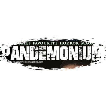
The masthead for our magazine is bold, with a horror-style font. The name of it is 'Pandemonium', which tells the audience that the genre is supernatural through the use of the word 'demon' within the masthead. There is a contrast of colours, as the masthead is white on a black background. This is also a binary opposition, suggesting that there are more binary oppositions within the film, such as good vs evil and religion vs demons/evil spirits. The font is important in connoting the fact that it is a horror magazine as it looks rough and unfinished because of the patches of black on the white text. Therefore, the genre is not only shown from the name of the magazine itself, but also from the way it looks. Also, the masthead should be recognisable and one of the first things that is seen on the front cover of a magazine, and our one is.
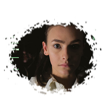
The main image for our magazine is of the protagonist in our film in the foreground, and the antagonist behind her in the background, but very dark so that it is near impossible to make out what she looks like. It is also possible for some of the audience to miss her when looking at the main image of the magazine because she is hidden away in the background so much. This is the effect we were trying to create with this image, which is how it looks like the antagonist is coming out of the darkness, and is making herself unknown to others around her. The lighting for this image is effective because on the left side of the protagonists face it is dark, whereas on the other side it is light. Our main image is unconventional in that it is not directly in the centre of the page, instead it is to the right, and cover lines are on the left side.
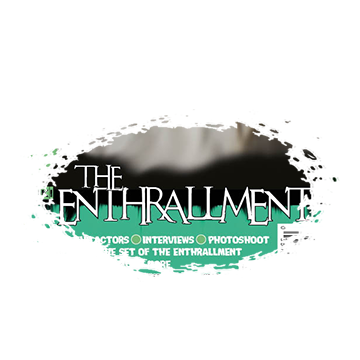
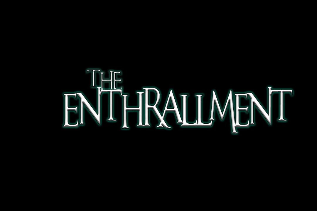
The main cover line for our magazine is the name of our film, 'The Enthrallment'. It is in white writing on both a green and black background. Because this is the name of our film, the font is the same throughout all forms of media, the magazine, the poster and the title slates within the trailer. This is so that when the audience sees it, they recognise who it is. The main cover line in our magazine is in big writing with a black stroke around it. It is just under the main image. We didn't want to place the writing over the image because the colours would clash and it would all look too squashed together.
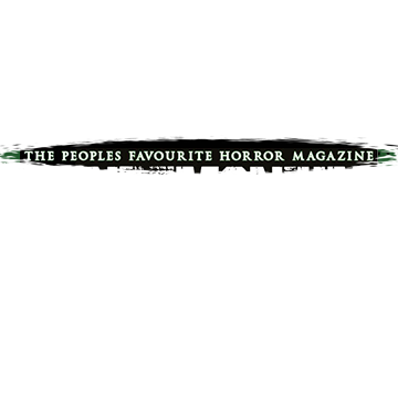
The selling line for our magazine is 'The Peoples Favourite Horror Magazine'. It is directly above the masthead, at the very top of the page. It is a different font to the masthead. Also, it goes across the whole of the top of the page, and it has a stroke around it to make it stand out more. It also uses the colours that are seen throughout the magazine from cover.
|
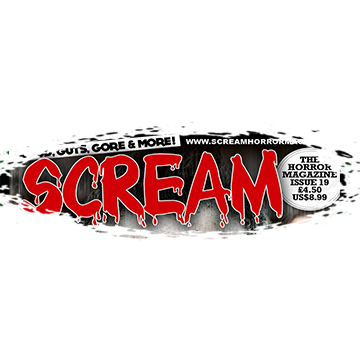
The masthead for the real media text is bold, with a horror-style font. The name of it is 'Scream'. This connotes that it is a horror magazine. The masthead is red on a mostly black background. The fact that it is red connotes that there is lots of violence, blood and gore involved. There is also the effect of blood drops in the masthead, further improving our understanding of what sort of genre of horror this magazine is trying to get across to the audience. Also, the masthead should be recognisable and one of the first things that is seen on the front cover of a magazine, and this one is.
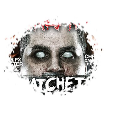
The main image for the real media text is of an antagonist. We can see that he is an antagonist because of the mise-en-scene. He is holding a hatchet and he looks like a zombie as well. There is text that goes over the main image of this magazine. Also, the image is in the very centre of the page, which is conventional.
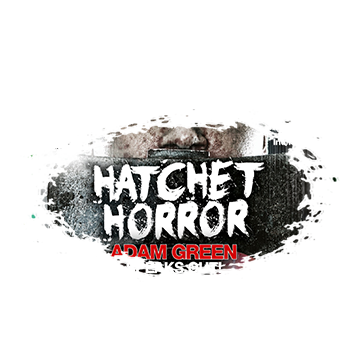
The main cover line for the real media text is 'Hatchet Horror'. This goes with the main image, as there is a hatchet in it. Furthermore, it uses alliteration as the words 'hatchet' and 'horror' both begin with the letter 'h'. This, like the selling line, was done for effect, as it is trying to get the audience to remember them. The writing of the main cover line is cleverly placed on a hatchet that the person on the magazine is holding. They are putting words with images. The font is rough looking, to make it absolutely clear that it is a horror magazine. It is also placed over the image, but everything still looks clear.
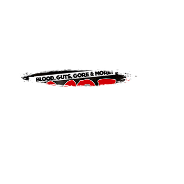
The selling line for the real media text is 'Blood, Guts, Gore & More'. It is above the masthead, but to make it look more interesting it is slanted at an angle. The font for it has got its own background, so it is black text on a white background, which is then on top of a black background itself. In order to make it sound more interesting, it uses a rhyme. This may be done to make it sound more flowing, and to to make it easy to remember.
|
Therefore, our magazine follows the convention of the masthead as it is similar to those of existing horror magazines. The similarities between the two mastheads are that they are both big and bold in order to stand out to the audience. Their fonts look like horror fonts, through the use of rough looking text or special effects such as blood drops. The name of the two mastheads link back to the horror genre to make it more clear to the audience that the magazine is focusing on horror. The difference is that our magazine masthead uses contrasting and simple colours, whereas the masthead of the real media texts doesn't use contrasting colours and instead uses the colour red.
Therefore, our magazine challenges the convention of the main image as it is different to those of existing horror magazines. The only similarity between the two main images are that the antagonist is in it, although in the existing magazine, the antagonist is clearly shown, but in our magazine, she is hidden at the back. The differences between the two are that the protagonist is mainly featured in ours and that the main image is pushed to the right hand side of the page.
Therefore, our magazine follows the convention of the main cover line as it uses it in similar ways to existing horror magazines. The two magazines are similar in that they are both big, and they both uses fonts they are not typically seen in magazines. They are unique fonts. Also, they are both in the bottom half of the magazine front cover. The differences are that the existing horror magazine has their main cover line on top of the main image, whereas we don't in our one. Also, they use alliteration to make it more interesting.
Therefore, our magazine follows the convention of the strap line / selling line as it uses it in similar ways to existing horror magazines. The similarities between the two magazines are that the selling lines are both above the masthead, which is an important convention as this is always seen in magazines. Also, they both use small text in comparison to the masthead, so that it doesn't stand out too much. The difference is that in our magazine, we try and sell it to the audience, whereas in the existing one, they try and get the audience to remember their magazine by using a catchy rhyme, that is also linked back to the horror genre, through the use of the words 'blood', 'guts' and 'gore'.
|
