By Sam
'How effective is the combination of your main product and ancillary texts?'
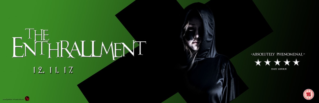
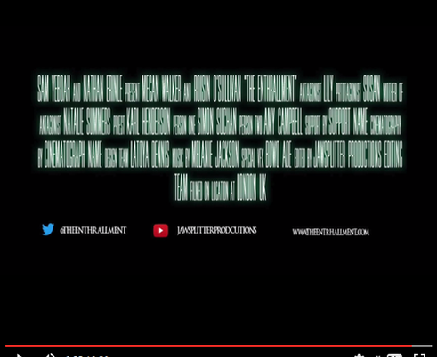
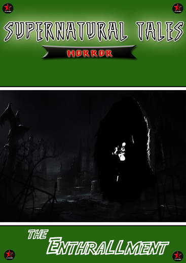
This is our evaluation page 2. Here you'll see the many different media platforms and formats that we chose to present our film 'The Enthrallment' . we'll be looking carefully at the ways that synergy, continuity and all around branding can result in the success of our trailer, magazine, and poster. We then take a look into cross media convergence and it's impact on the success of the main product and ancillary texts. Cross media convergence is the coming together of
AN Example
|
|
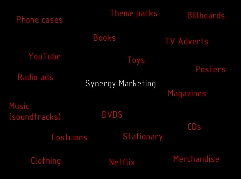
Examples of Synergy & Ideas of Media Convergence
In order for a film to be successful, not only the film itself should gain the makers a sizable amount of money, but also other forms of media related to the film should sell a lot, and even more money is made that way as well. They also put a lot of time into marketing the film. This is done through advertisements. Therefore, other ways in which money is made is by getting the message across about the film, and bringing out many film-related items. Below are some of the ways in which film franchises advertise their films, and create items based on their films:
Success of real media texts
by nathan
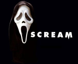
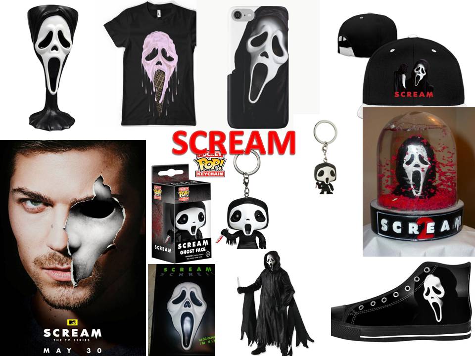
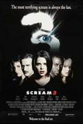
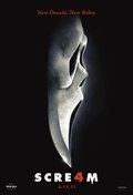
Scream is a great example of a film that was so effective it became a horror franchise. Although our film isn't categorised under the same sub-genre as Scream it shows great use of Synergy and Cross Media Convergence. A franchise produced by The Weinstein Company, Dimension Films, Corvus Corax Productions has a complete set of four films and a new TV series that has come out in late 2016, showing that to this day the franchise is very strong. As an example of the franchise's success Scream has produced over $600Million in the worldwide box office. It;s due to successful CMC and Synergy that led to it being one of the most successful horror franchise's of all time.
|
|
|
|
|
|
|
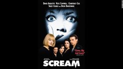
In 2017 it's almost impossible to not have heard of the Scream franchise. It's so well known due it being so iconic and having such a strong brand. One of the most notable thing's about the brand is the use of the ghost mask. Much like the golden arches of the McDonald's logo when you see it you know exactly what it represents. Continuity through much of the products is what makes the brand so strong.Whether it's on the film poster, DVD case, blu ray or merchandise such as shirts or mugs. A dark background with the saturated white image of what is usually a closeup of a shocked face which is similar to that of the mask which connotes the antagonist is a recurring theme.
|
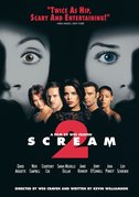
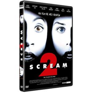
Here is an example of the first franchise sequel presented on a different media platform - DVD. This was around 1997/98, so the only to access the movie was to go and watch it again in the cinema, or purchase the movie on DVD, as illegal sites had not become popular at that time. This product follows the continuity as it uses the three colours, red, white and predominantly black. Once again following the convention of an all black background and washed, white faces with small amounts of red to pop against the monotone colours. The logo has an iconic dip in the 'M' to make it resemble a knife point which is very much present in each film.
|
|
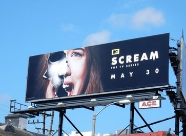
The Scream franchise has been around since the late 90s and was prominent as one of the best Slasher movies of its time. As such, if it wanted to stay relevant in today's era of horror it had to reinvent itself, which is what it did by creating a more modernised, television series with new characters and a new storyline, separate from the movie sequels. This new television series helps re-cement Scream's relevance and create continuity in the franchise, putting itself forward to newer generations of horror-lovers and inducting them into this age-old industry.
|
|
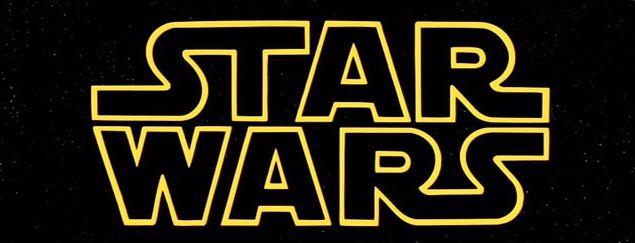
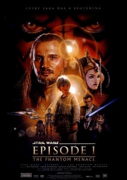
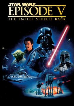
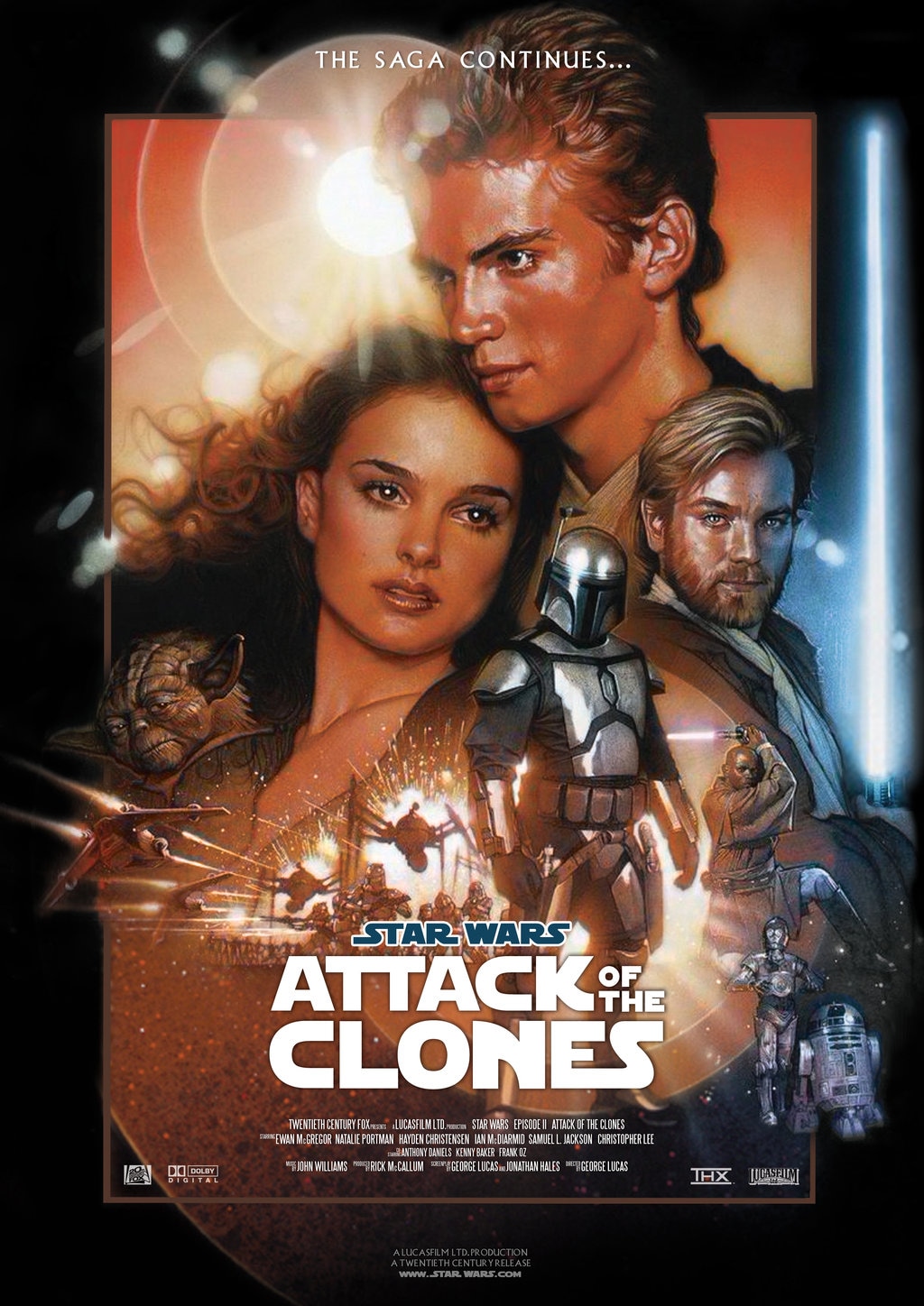
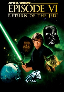
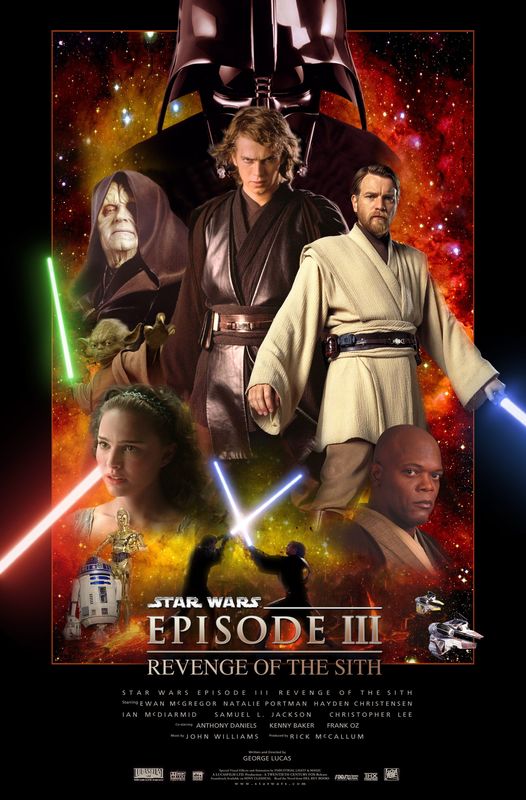
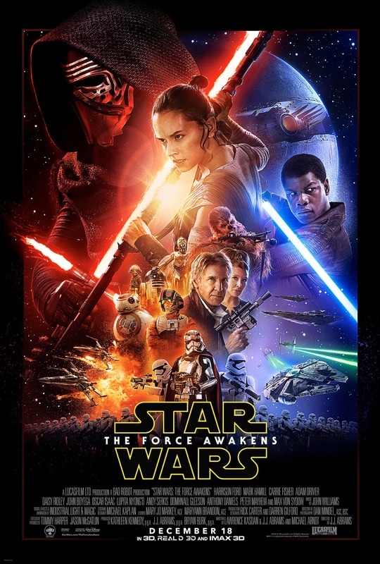
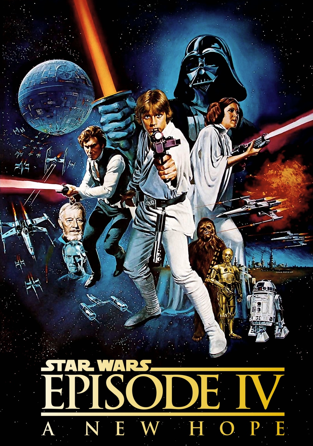
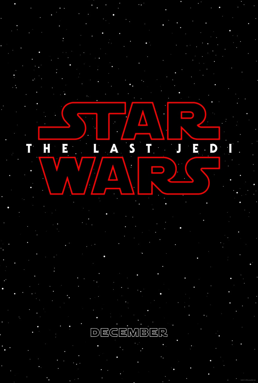
Another example of a franchise which has benefitted greatly from effective use of CMC, continuity and synergy is Star Wars. The films series consists of eight mainline films spanning from 1977 to 2017. With 20th Century Fox as the past distributor and Walt Disney STudios Motion Pictures as the current distributor the Star Wars franchise has brought in a combined box office revenue of $7.471 billion.
|
|
|
|
|
|
|
|
|
|
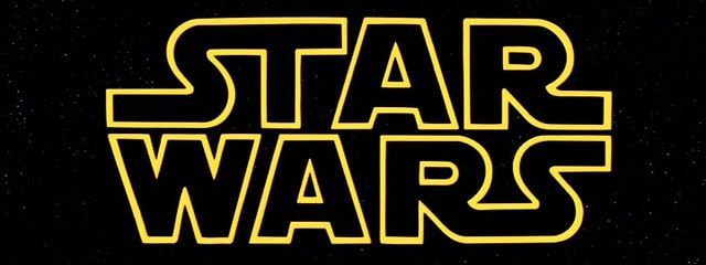
The Star Wars logo uses a very specific typography which is unique only to it. When seeing the logo besides just seeing the words the font and background of stars is very recognizable of the series. Since 1977 this typography for the logo has been used in each and every film. Over the years the success of each film has increased. This is evident in the Original grossing $786,598,007 at the worldwide box office while 'The Force Awakens' (2015) grossing $2,058,662,225. This goes to show that the branding and marketing potential has been there from the start and the weiight that the logo carries has only increased over time.
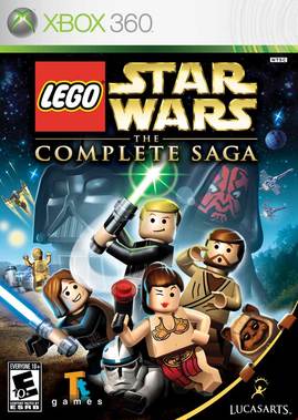
Even in their game franchises, the house style of the cover art is still identical to that of the movie posters. The typography of the franchise name is the same throughout all three. The first game, Lego Star Wars was originally three games: Lego Star Wars, Lego Star Wars II, and Lego Star Wars III: The Clone Wars (the first two originally released on Xbox). They spanned over the span of six years, going from 2005 to 2011, and received so much critical acclaim that the first two were remastered for the Xbox 360, combined with the third and made into one, complete saga game.
|
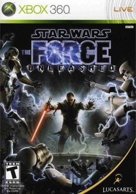
The Force Unleashed was a breathe of fresh air for the franchises consumers, as the plot was not linked to that of the movie franchise, but it was not too vaguely displaced from the main storyline of the Star Wars, and so had some continuity. The game was critically acclaimed, selling 1.7 Million copies across all game platforms, becoming the third best-selling game globally of 2008. The Force Unleashed was both the fastest-selling Star Wars game and LucasArts' fastest-selling game.
|
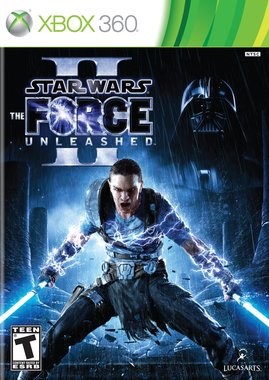
The Force Unleashed 2 was the direct sequel to the first game, released across all gaming platforms. performed under expectations. In the United States, it sold 500,000 copies within its first two week, therefore becoming the fifth best-selling video game of October 2010. It was the fifth-highest selling game of the week in the United Kingdom, denoting sales of 56,064 copies. The game was an overall flop, and did not get much acclaim.
|
|
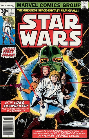
Similar to many other successful films such as The Avengers, Man of Steel and Spider-Man, this movie franchise has a vast collection of comics. The Marvel Star Wars series of comic books was the first ever comic series created for the saga. It spanned 107 issues, with three special Annual issues. The series was relatively long-running, lasting from 1977 to 1986. It was published by Marvel Comics. In October 2012, The Walt Disney Company announced that they would acquire Lucasfilm for $4 billion. In January 2014, it was announced that in 2015, the Star Wars comics license would return to Marvel Comics, whose parent company, Marvel Entertainment, Disney had purchased in 2009.
|
By Latoya
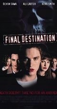
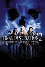
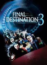
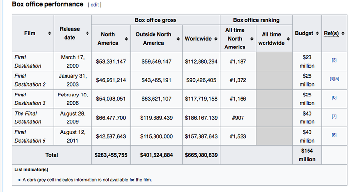
Final Destination is an American Horror Franchise composed of five films, comic books and novels. This is an excellent example of a horror franchise which shares the same sub-genre as our horror movie. The synergy marketing strategies used were extremely successful as they collectively grossed over $665 worldwide.
|
|
|
|
|
|
|
|
|
|
|
|
|

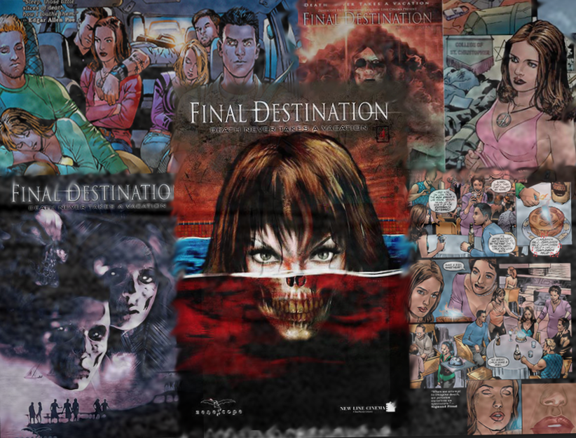
Final destination have used many different types of marketing techniques to promote their products; such as DVDs, Merch etc. Below I have listed some of the unusual and unique ways in which they have promoted their brand.
MERCH

COMICS
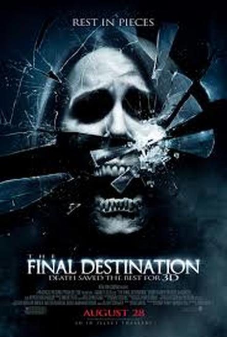
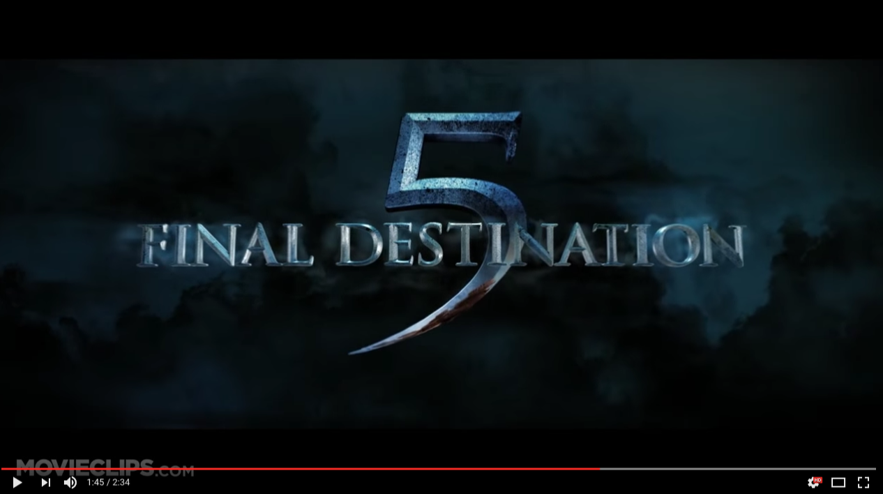
final destination - trailer & poster

|

|

|
|
|
|
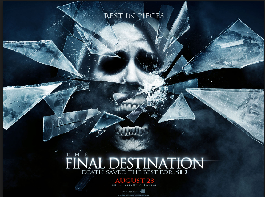
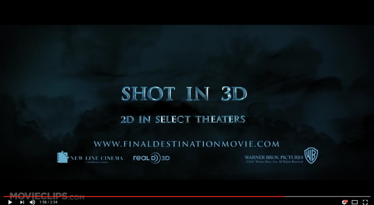
Fonts: The fonts used in the title slates within the Final Destination trailer are consistent as they are the same and use the same positioning, sizing and colours as in the poster. Furthermore, this is beneficial for the target audience of this film as they will be familiar with the house style of the poster and trailer and they will be able to recognise it is easily.
Colour Scheme: The colours used within the poster and trailer tend to be dark and dull - using colours such as dark blues and greys. These colours are used consistently throughout the trailer, especially in the title slates and also the poster.
Imagery: The imagery used in the trailer and poster are also very consistent as it includes a dominant image of a 'skull'. This is a very recognisable device which they have to used.
By Sam
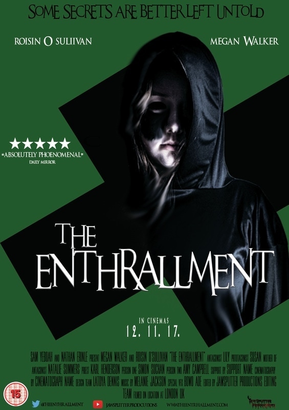
The Enthrallment (ours) - trailer and poster
|

|

|
|
|
|
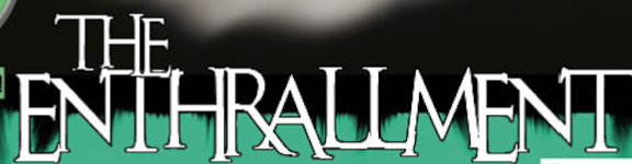
Throughout our trailer, we have used dark colours which we have also used consistently throughout our other products such as our magazine and our poster which has been shown above. In our title slates, we have used green colouring around the text. The colour green has been very dominant and consistent throughout our media products as shown above we have used the same shade of green as the background colour of our poster.
Trailer & Poster
by Sam and Nathan
|
|
|
Font: The font used for each of the title slates is the same as that used in the poster. This is important because all forms of media to do with the film remains consistent throughout. Also, if the fonts used for the trailer and the poster were different, some people may get the impression that the two products are for two separate films. This is because there would be no brand identity, and the audience would be unable to recognise this film. Brand identity is another thing that contributes to the importance of using the same fonts throughout all media forms.
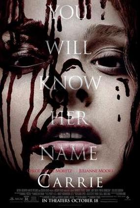
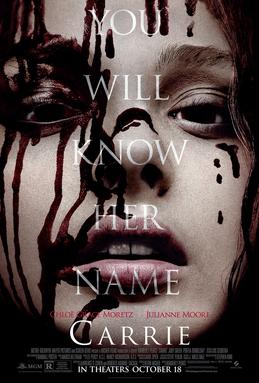
Colour Scheme: The colour scheme of the trailer and poster for Carrie are very similar. In the trailer, even when brighter colours are used, they are still quite faded to give a black and white feel to them. In the poster, there is also a dull look to it because of the use of the colours.
Characters: A common thing seen in the main image of the poster is the main character in the film. This is the same for the poster Carrie, it uses the main character as in the image. Also, for this poster it uses an image that is very similar to an image seen in the trailer. This signals the continuity between the trailer and the poster, which have to have some similarities in order for them to work well with each other. Other characters seen in the trailer include Carrie's mum, and various teenagers that go to the same school as Carrie.
And Ours
|
|
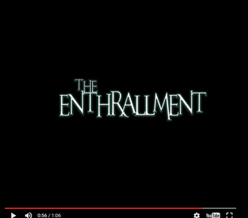
The font that was used on the poster is almost identical to the font used on the magazine. We used a very specific font that couldn't be used in main body text as to make the largest text on the poster or magazine pop more than the coverlines for example. This was in order to make the poster and magazine as professional as possible. The same font is present in the trailer using the same colour with a slight green glow behind it.
|
|
One of the most important features of our trailer and poster was the colour scheme. We decided that a green to light green scheme was most fitting for a supernatural sub genre trailer. This is why throughout the trailer our shots were colour graded to have a slight green hue to keep with the branding of the film across the other texts that we produced. A sense of continuity is kept by having recurring characters in the trailer and on the poster that all follow the same colour scheme.
poster & mAGAZINE
by Sam and Nathan
|
|
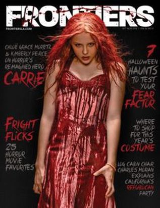
FONT: Looking at the research that we did we found that the font used on the poster for a film isn't usually the one that is used on a magazine, however the font will be aesthetically similar and will make an effort to be appropriate for the film that it is promoting.
COLOUR SCHEME: It can be seen in these two examples that the colour scheme is extremely similar. The red, white and black is prominent on both the poster and magazine. A strong correlation between the colours used between the poster and magazine is extremely important for continuity so that consumers are able to recognise it. Especially since the FONT used isn't exactly the same on each of the two promotional materials.
CHARACTERS: Both the poster and the magazine have one main image. This is o Chloe Grace Moritz who is the main protagonist/antagonist of the film. She is catered as the primary and only image o both pieces and is the centre of attention. The blood that she is covered in is present in both the poster and magazine which allows for the same tone to be connoted in continuity.
And Ours
|
|
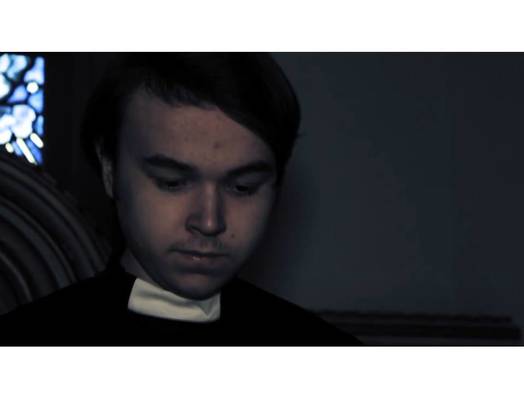
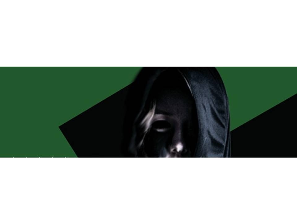
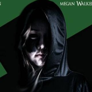
Although not very visible in the magazine our protagonist is a big part of our promotional material yet she is always denoted in a cloak which conceals her true appearance.One of the many things that we chose to keep consistent is that the antagonist's eyes are blackout out. It is a recognizable feature that was kept consistent to add an element of continuity to magazine and poster.
TRAILER & MAGAZINE
by Sam and nathan
|
|

|
Font: The font used for each of the title slates is different to those used in the magazine. Although it is conventional for the fonts to remain the same across the trailer, magazine and poster, this magazine uses a separate font, possibly to try and distinguish it from the rest of the products such as the poster and film trailer.
Colour Scheme: The colour scheme of the trailer and magazine for Carrie are similar. In the trailer, even when brighter colours are used, they are still quite faded to give a black and white feel to them. In the magazine, there is also use of black and white, but red is used as well.
Characters: A common thing seen in the main image of the magazine is the main character in the film. This is the same for the magazine for Carrie, it uses the main character in the image. Other characters seen in the trailer include Carrie's mum, and various teenagers that go to the same school as Carrie.
Our trailer & magazine by nathan
|
|

|
|
By Sam
Trailer and Website
An Example
|
|
|
FONT: The fonts that are seen on the title slates of the trailer for are consistent with all the other trailer for the other 6 movies and can also be seen on promotional pieces as well as the website. Continuity is seen all throughout the series and is essentially the brand as it is the largest text on screen.
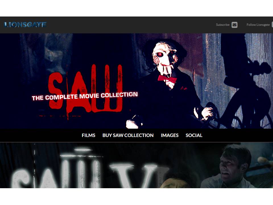
COLOUR SCHEME: The colour scheme is white and red. The white and red is seen in the red and white spirals which can be seen all ver the franchise and is seen throughout the trailer and is present on the website. It's the continuity between the trailer, posters and website which has made saw the most successful horror franchise of all time.
CHARACTERS: As a horror there are many characters that will join and then be killed off very quickly. However one face that the whole franchise centres around is that of Jigsaw, the puppet. Jigsaw will repeatedly appear throughout al of the trailers and lost every piece of promotional material.
And now ours
|
|
|
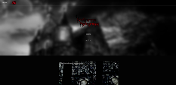
The colour scheme that is present in our trailer is very much black and green. These colours are present throughout much of our websites and are recurring in much of the representation. At the end of the trailer where it has the release date it is following the black and green colour scheme that we used and also uses the same font that can be seen in all of our promotional material.
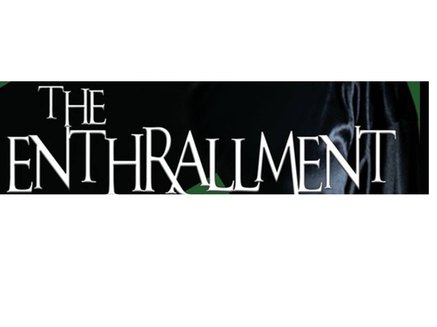
LOGO
|
|
|
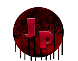
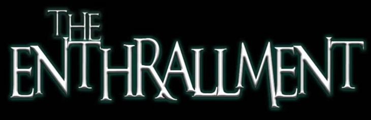
The logo of our film and of all the products to do with it, features on our website and on our poster. The two logos are slightly different, only in that they are different colours. They use the same font, which makes the audience understand that the two logos on the two separate products are linked to each other. Our logo was not featured on our magazine, but we put it on our poster and website in order to distinguish our brand from the rest of them, and to ensure that we have brand identity.
Brand IDENTITY
by Sam
The branding of a film franchise is imperative when it coms to cementing it into the minds of the movies' audiences. This is due to the fact that branding has become more important in generating revenue if the movie does not do the intended job. If the other avenues of creating profit do not perform their functions and the film does not succeed then the entire franchise itself will be seen as a major flop. Brand identity is made up of three major components; the film title, the typography/font, and the colour scheme. Media platforms won't always use the same colour for the film title, but there will always be a strong and identifiable tether between them. A successfully branded film will be identifiable to the audience the moment they see the typography of the film title.
Examples
|
|
|
|
Our own By Sam
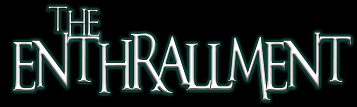
Across our finished productions, the title of the film - The Enthrallment - is written with the same typography and colour scheme. Constant representation of brand identity is imperative is when creating an iconic brand, the colour scheme is a convention that would not be too difficult to alter if it would not correlate well enough with the colour scheme of the media platform it is presented on, however, compromising the colour scheme to the extent that the brand would be completely different and unrecognisable just to suit the platform is not an option. The typography we used when creating the title for our movie 'An Unfortunate Event' is currently our strongest form of brand identity, as it can be repeated for ever sequel we make, Just like with the Harry Potter film franchise - every film title has the same typography, even if the font of them is different.
Brand identity is equally important for the production companies making the products as the movies they produce. Every production company needs a strong and reliable emblem so that they garner enough attention for their companies. Emblems are how companies are best recognised when there is no room for the company name to be presented. The consist of the company's colour scheme and is usually abbreviated down to the most recognisable picture/letters from the company name. The most iconic logos do not need to adapt to suit the theme of wherever it may be being placed, unless it does not correlate with the style of the media text being presented. There are some logos that are originally in 3D such as 20th Century Fox but can be made to look 2D in order to feature on 2D media platforms such as posters; or the Warner Bros logo, which is also 3D, but can be adapted to suit the media text. It is important to have a logo that can adapt in situations such as that so that you can still build on the brand identity of the logo whilst maintaining the theme of the ancillary text.
Examples By Sam and Nathan
|
Twentieth Century Fox Film Corporation (New)
|
Twentieth Century Fox Film Corporation (Old)
|
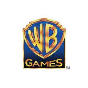
Warner Bros Games Logo
|
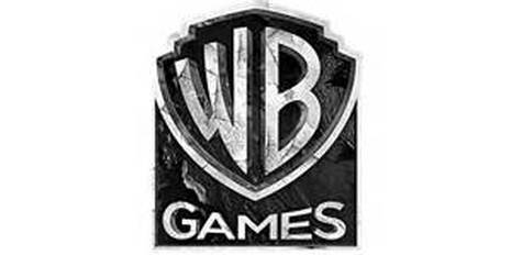
Warner Bros Games Logo (From Batman: Arkham City Video Game)
|
oUR bRAND iDENTITY
By Sam
|
|
|
For large media conglomerates that own many smaller companies their actual brand identities aren't emphasized too heavily. This can be seen in the fact that an entertainment or media company can be taken over by a media conglomerate while already having a strong brand. It's foe this reason that giant multi-nation media conglomerates aren't instantly recognizable by their logo like the companies that they own. One example of this would be 21st Century Fox which is the media conglomerate that owns 20th Century Fox.
Owns
|
|
|
|
And ours
By Sam, Latoya, Karl
To further show our understanding of how branding works in modern day media we decided to take our production company and expand it into a multi media conglomerate which parents a number of subsidiaries, and smaller media corporations including our company, JawSplitter Productions.
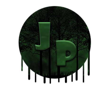
JawSplitter Productions Inc. is a British diversified mass media corporation headquartered in Christ the King Studios, Christ The King. JawSplitter Productions Inc. has several subsidiary companies, including JawSplitter Productions Home Video, JawSplitter Productions Animation, JawSplitter Productions Television, JawSplitter Productions Records, DangerZone Studios, and All Star Comics.
|
JawSplitter Productions Animation, is the animation division of JawSplitter Productions Inc. JawSplitter Productions Animation focuses upon the production of television and feature animation of other properties, including those that are related to Jawsplitter Productions Inc.'s All Star Comics publications. JawSplitter Productions Animation has also produced TV series' with sister company JawSplitter Productions Television.
|

|
|
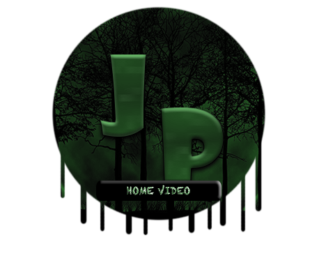
JawSplitter Productions Home Video, is the home video distribution division of JawSplitter Productions Inc. On it's parent companies store website, JPShop.co.uk, there is an Archive Collection which allows the public to order custom made DVDs of rarely seen films and TV series from the JawSplitter Productions library. JawSplitter Archive DVDs and downloads can be ordered online on the Jawsplitter Productions Inc.
|
|
JawSplitter Productions Television, is the television production of JawSplitter Productions. It has produced many television programmes owned by JawSplitter Productions Inc. The television programmes are broadcasted on a range of different channels owned by the production company: JawSplitter Television (best known as JawSplitterTV), JawSplitter Films. JawSplitter Cinemagic, and in addition, JawSplitter TV Animation. JawSplitter Productions Television has also produced TV series' with sister company JawSplitter Productions Animation.
|

|
|
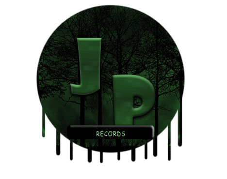
JawSplitter Productions is a British record label tis owned by JawSplitter Productions Inc. Originally founded to release movie soundtracks, although, famous artists such as The Weeknd have featured their tracks within our label.
|
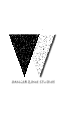
DangerZone Film Studios Inc., is a British film studio. It is now a subsidiary of JawSplitter Productions Inc. The studio continues to operate its financing, producing, marketing, and distributing operations of its own films with the DangerZone Studios logo, and also does with JawSplitter Productions.
|
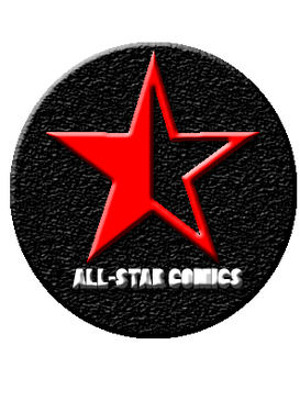
ALL-STAR Comics Inc. is a company operating in the market for British comic books and related media. It is the publishing unit of ALL-STAR Entertainment, a company of JawSplitter Productions Inc. ALL-STAR Comics produces material featuring a large number of well-known characters.
|
SYNERGY THROUGH OTHER MEDIA PLATFORMS
In this section you will see the different types of synergy through the varied media platforms we are going to advertise our film on. Latoya created the photoshopped images of the advertisement, media platforms, websites and e-commerce, sequels and other. Latoya also done some of the writing. Sam and Karl helped out with the writing also.
ADVERTISEMENT
|
By Latoya, Sam
|
|
|
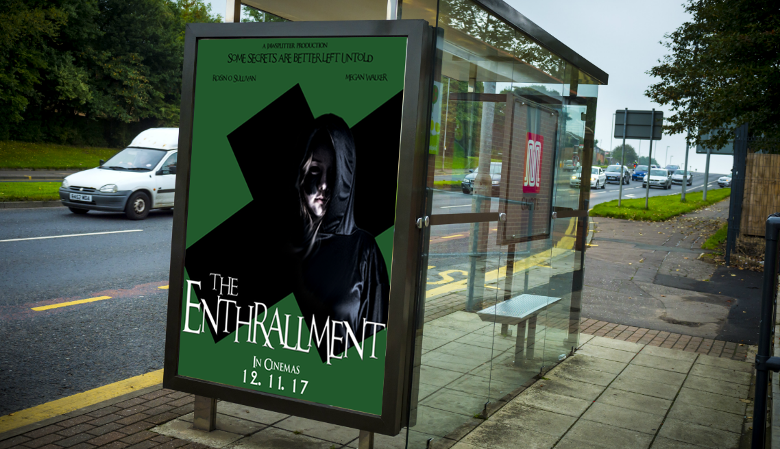
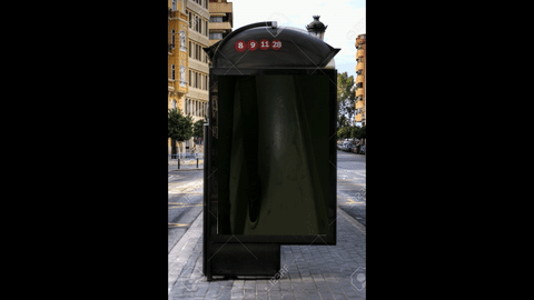
As shown above, here is an image of our 'The Enthrallment' poster being advertised on a bus stop somewhere in London. We have changed the original format of our poster as our aim is to highlight the important information which includes; the name of our film, the release date, the tagline and who stars. We have done this because people will only see this for a short period of time as it is being advertised on a bus stop.
|
|
|

|
|
|
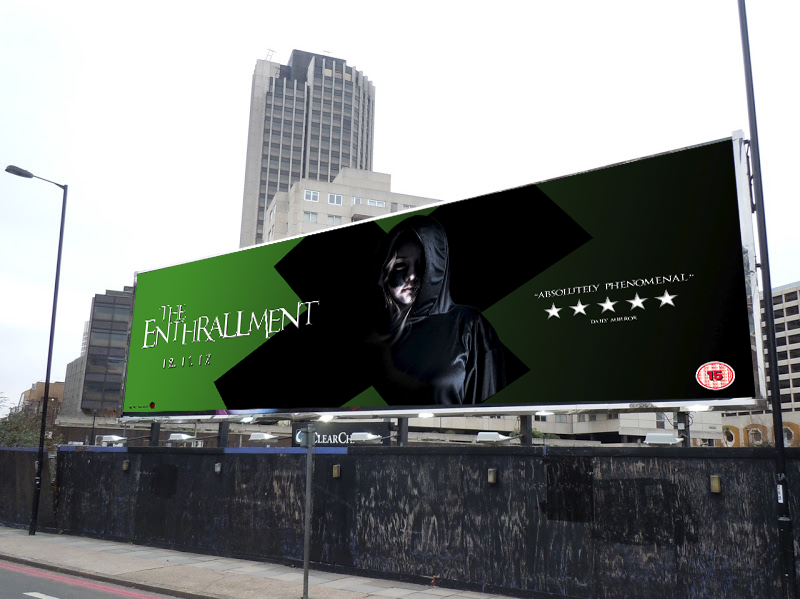
Here is an image of our banner for our film being advertised on a billboard. We have included important information such as the release date, main image, rating, production company, and the title of our film. We have decided to this as it highlights important information which is relevant as it is easily visible to our target audience.
|
|
|
|
|
|
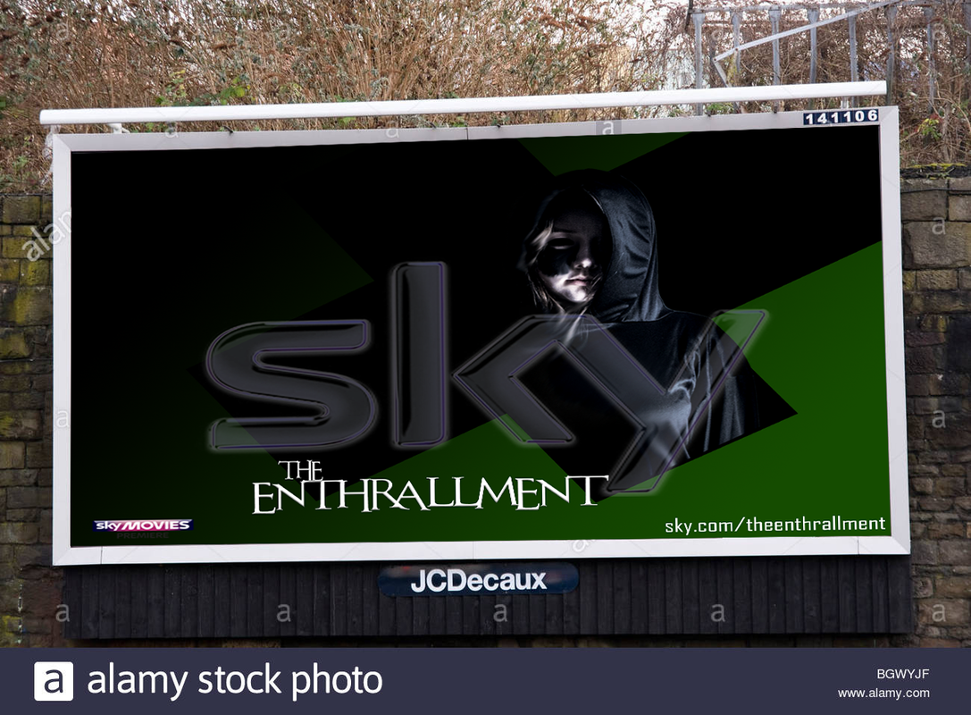
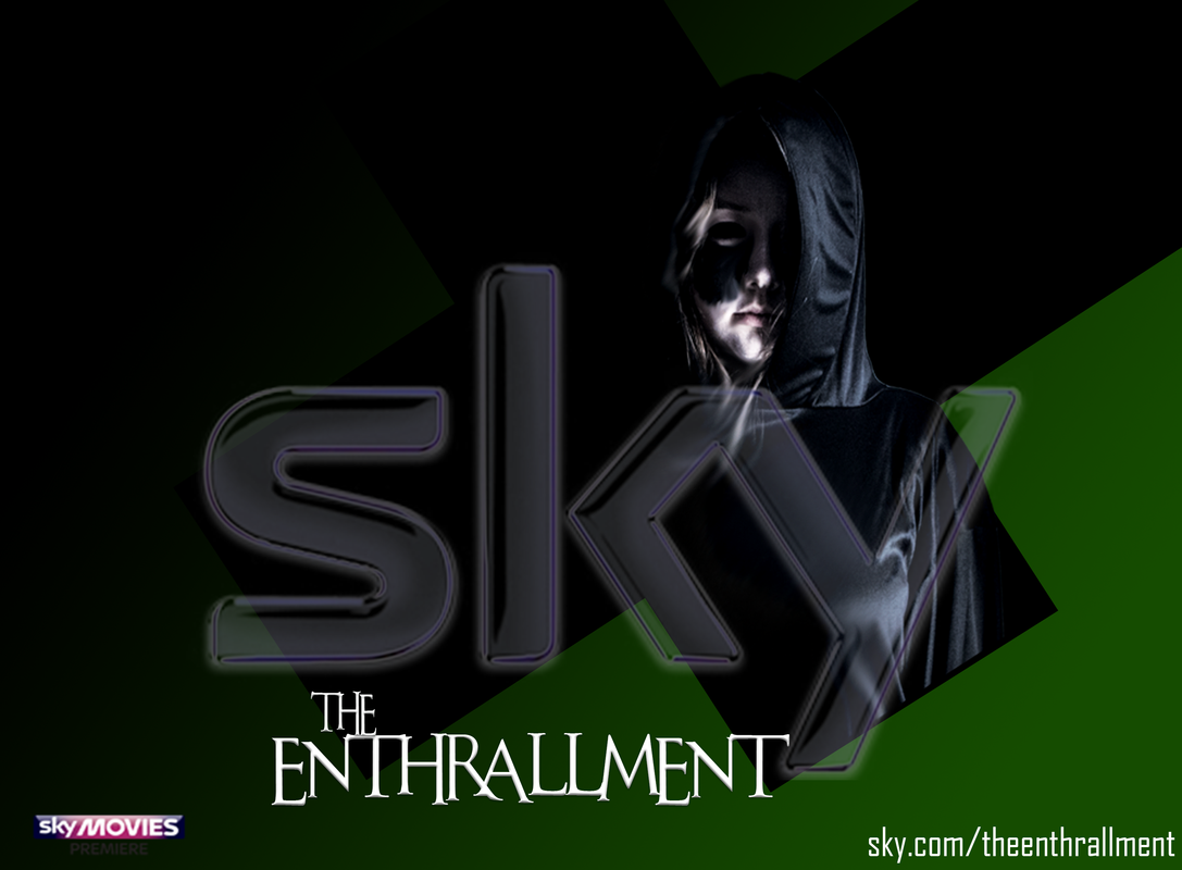
Above is a picture of our film being advertised on a billboard somewhere in London. We have used a similar design in terms of typography, imagery and colours. We have done this so that it is recognisable by our audience as they would most likely be seeing it for a short period of time. The advert is from Sky, a British satellite broadcasting company, and in particular Sky Movies and we have used their logo so that our audience know thats where the film will also be accessible from. We have also included our films title in the corner.
|
|
|
|
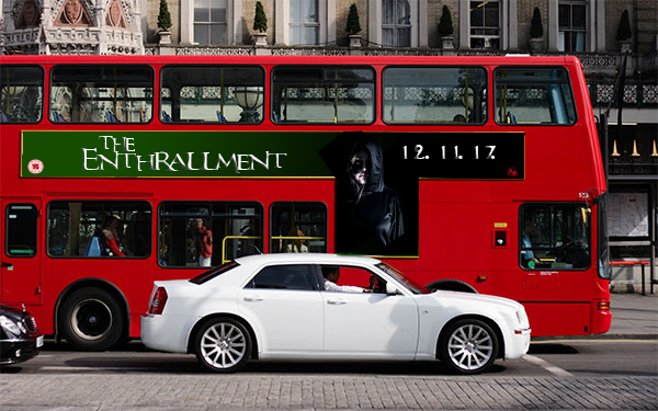
Above we have used on bus advertising to advertise our film. We have used the same colours as on our poster and magazine. Although, we have included key information such as the title, age rating and the release date. We have included this information as our potential audiences may only have a glance of this type of advertising therefore, we made sure we included the most key information so our audiences can find out more.
|
|
DIGITAL ADVERTISING
By Latoya
|
|
|
|
|
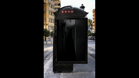
Above shows the way we have used digital advertising to advertise and market our film around London. We have used key and tense moments in our film to attract audiences to watch it. These ads will be effective in attracting our audiences as it is a modernised and interactive way of advertising therefore, our audiences will be intrigued to find out more.
|
|
MEDIA PLATFORMS
By Sam, Latoya
|
|
Above, is an image of our films comic book cover. Over the years, there have been films releases which have comic books based on them such as Final Destination. These comics tend not to share the same typography as the film etc. hence why the image does not share the typography as ours.
|
|
|
|
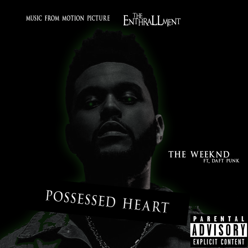
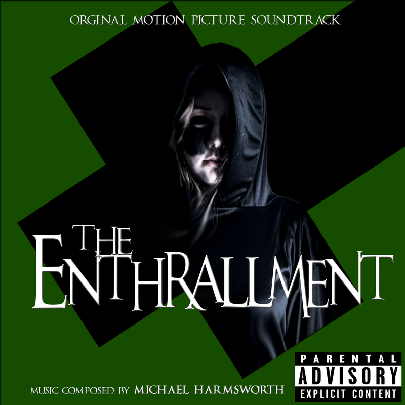
Above are two album different versions of album art. Both are based around the film however one is more centered around the artist themself as to bring in their audience to our movie. Film soundtracks that have been worked on by famous artists will have lyrics that relate directly to the theme of the film. A few films that had successful singles recorded for them are Scott Pilgrim vs The World (2010) and Skyfall (2012). On the left is the single 'Possessed Heart from the soundtrack of the film by The Weeknd who is a very successful artist in 2017. The colours used on the front cover single cover art are the same as the colours that are present on the film poster. On the right is the original motion picture soundtrack which adheres to the continuity with the image and colours used.
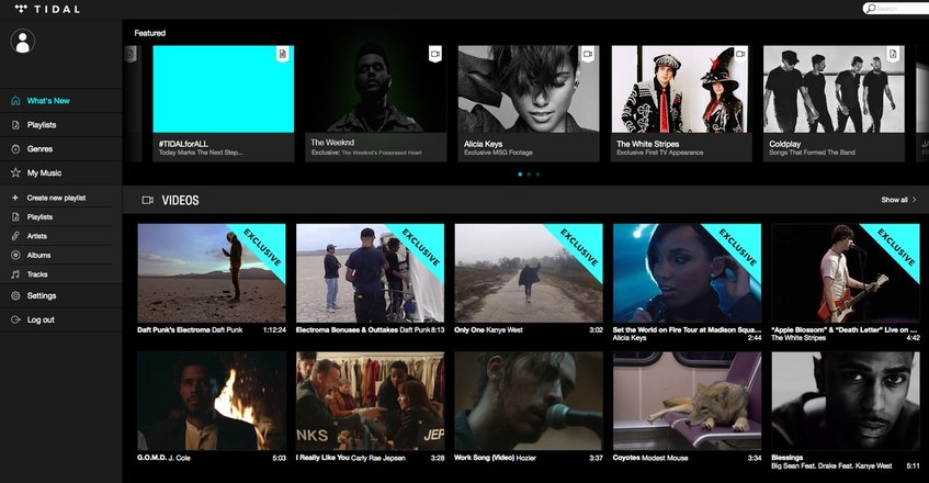
As shown above, the image is TIDAL's home page which features The Weeknd's single 'Possessed Heart' from the soundtrack of our film. This is beneficial for us and our brand/company as it is featured on the home page. Music isn't sold the way that it used to be. t is more likely for a song to be bought or streamed online than to be bought in a store so having this type of exposure on the main webpage is hugely beneficial to the film. As Tidal has over over 4.2 million paying subscribers our film's soundtrack would be available to a mass of people.
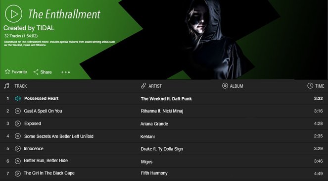
Part of the full soundtrack is visible on the film's own soundtrack page which is available on Tidal. Tidal allows for the creator or owner of the music to choose a specific design of their page so we were able to create a banner that further exposes the many users to the contuinuity especially in the green colour and recognizable brand of the crooked cross. On the 'The Enthrallment' soundtrack is the single 'Possessed Heart' by The Weeknd as well as a number of other songs by other well known artists. The fame of the artists is also a factor in attracting a large audience with a use of celebrity specific symbiosis.
|
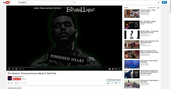
On the right is an image of the previously seen sing;e's YouTube page. As the song is by the Weeknd it is on his VEVO meaning that it woill be seen by his currently 8,331,995 subscribers and more as many people have not made their own YouTube channel but still choose to listen to music on YouTube. Often when an official music video is made for a single of a movie there may be clips of the film and clips of the artist singing integrated into one video to for a symbiotic trailer of sorts for both parties. Also the nature of YouTube's suggested feature is that when people watch a certain video they can see links to another on the side so they can click on the thumbnail and be redirected to the other songs. This means that the millions of people that are watching other songs by The Weeknd can also watch ours by clicking on it's thumbnail in the 'related' or 'suggested' columns.
|
|
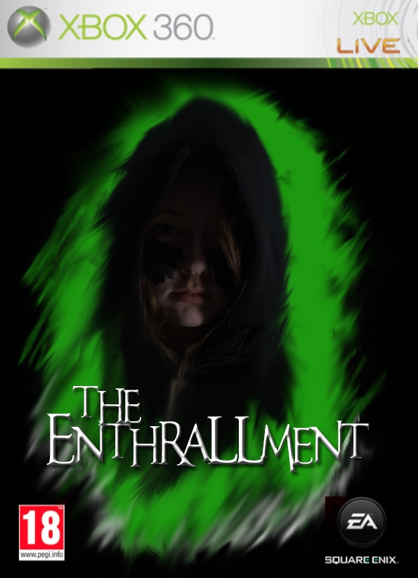
Above is an image of the cover art of our Video Game 'The Enthrallment' which is based on the film of the same name. Videogames often very closely follow the typography, colours, and overall continuity of a franchise as to make them very recognisable to the audience. They can often have images of the same actors and characters present. Often films that are produced and them have a videogame made after them are produced by major film studios with many subsidiaries, often in the game developing departments. The base conventions of a videogame cover are present with the banner being for a specific games console. Another convention being the inclusion of a PEGI age rating of 18 which is appropriate for the audience of this horror film. The typography is also the same as on the film and the colours are also keeping with the green theme.
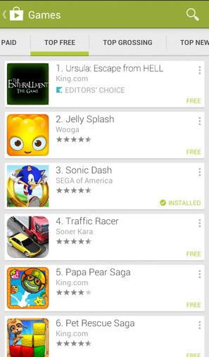
In the modern day almost every single person has a smart phone which uses applications. This means that creating a CMC app which is available to a wide range of people is very helpful in spreading word of the release of a film and getting consumers to buy tickets. Above is an image of the game application that is based on our film. It is shown in a top 10 list as number 1. The playstore is the digital platform used for developers to distribute apps and games on many devices. Seeing as they have a contract with Samsung which is a company that mass produces smartphones our app and as a result our film will get a lot of exposure through this use of CMC. We have chosen to give the app the same continuity and typography as to keep it in line with the theme of the franchise that we have created.
WEBSITES / E-COMMERCE
By Sam, Latoya
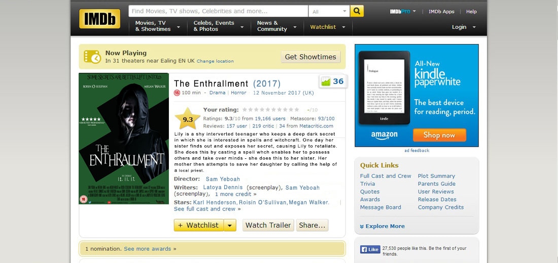
This is a picture of our films IMDb page. This website is a a internet movie database (as is stated in it's title). It works as a showcase platform for information on films and has expanded to TV shows and even videogames. In 2017 IMDb is the 47th most visited webpage and has over 70 million users. The poster used is the official that is used to promote the film on almost all platforms so all continuity is still in place
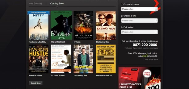
Above is an image of our film featured on the Cineworld homepage. Cineworld along with empire cinemas and Odeon cinemas is one of the largest chains of cinemas and certainly one of the most competitive. The website allows for specially featured films that are blockbusters and likely to do well. They have a small slideshow showcase area in which the user can view a small preview or trailer for the film The user is able with a small number of clicks to buy tickets for the film straight from their computer or smart device. Once again the continuity of our film remains present with the use of a deep green and black colour scheme.
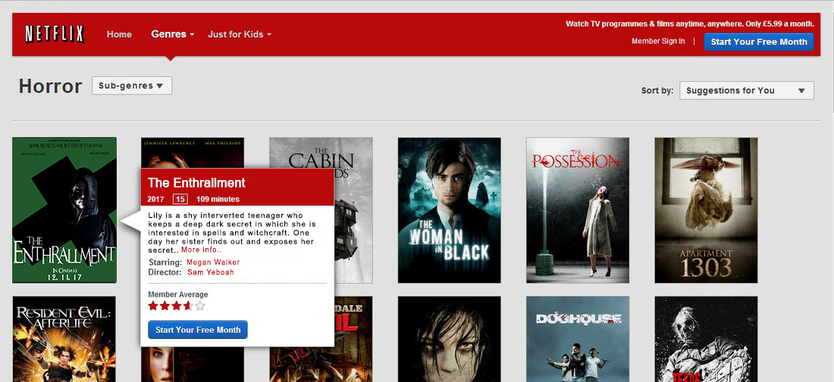
This is an image of our film featured on the Netflix homepage, under the sub genre of horror. Netflix is a subscription-based movie and television show service that offers media to subscribers via internet. We used the poster for this, and kept everything in the same format as it looks on the Netflix website, such as the title, the year of release, the age certificate, the time it lasts, and a synopsis among other things. These things appear on the screen when hovering the mouse over the poster.
sequels
By Sam, Latoya
|
|
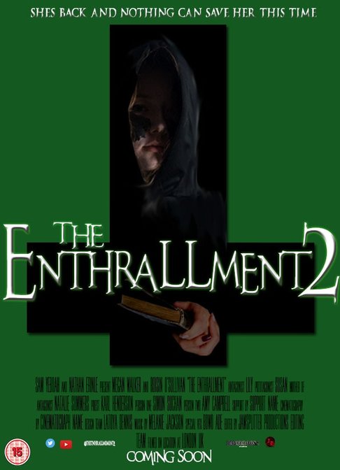
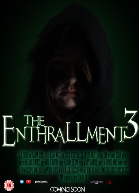
These are the two posters for the sequels to our original film, The Enthrallment. We kept the same title, but just made them The Enthrallment 2 and The Enthrallment 3. This is similar to one of the most well-known horror franchise, Paranormal Activity, which uses the same title, but just numbered differently. Sequels are a good idea to do because you are not creating an entirely new product, where you will not know how the audience will react to it. Instead, we would have our fans of the original films who would be interested in watching these two sequels. In terms of typography and continuity, all three posters use the same font in order to keep it recognisable to the audience. the layout of things are also the same, such as the age certificate, our website and the billing block. The main image is similar for all three poster as well, but there are slight variations, to make it distinctive that there are separate products. The colour scheme is also continued throughout the three posters, as they all use the colour green predominantly, with the use of black and white as well.
OTHER
By Sam, Latoya
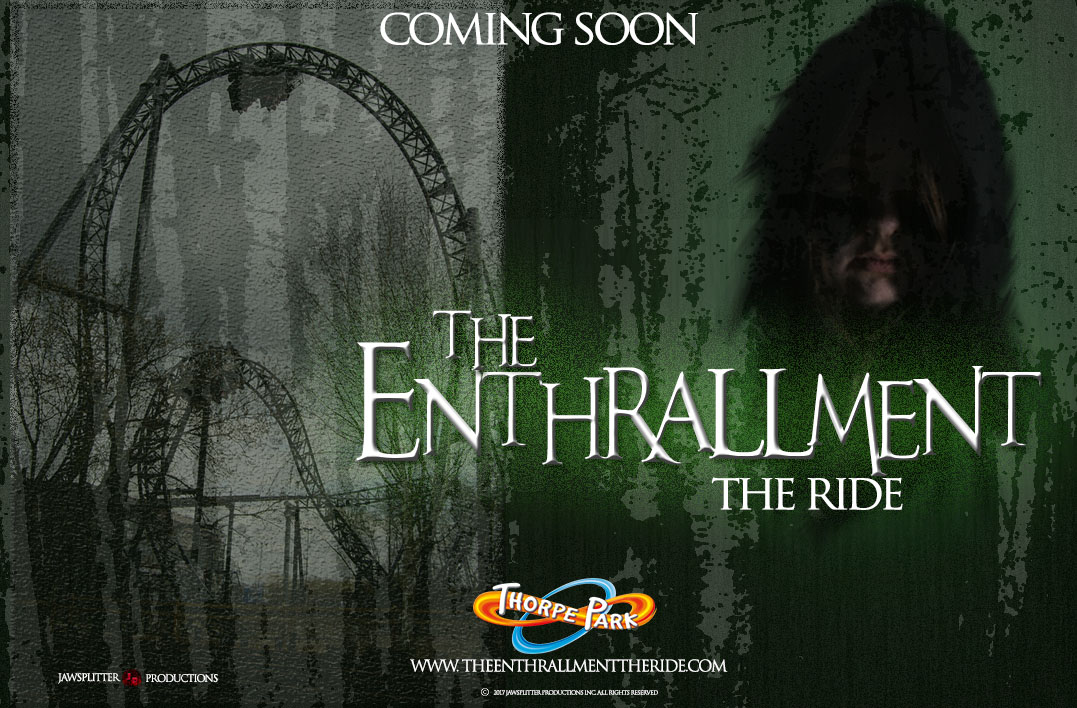
This is the advertising poster for the release of The Enthrallment: The Ride. It is located in Thorpe Park. The ride is themed around our horror franchise, consisting of all different forms of media including our film, The Enthrallment. The font that was used for our advertising poster for our ride is the same as the font used for our magazine, poster, and the title slates in our film trailer. Also, in order to keep the image of our franchise recognisable and similar to each other, the colour scheme is the same as we used throughout our other various products, mostly green, but with black and white as well.
SOCIAL MEDIA
|
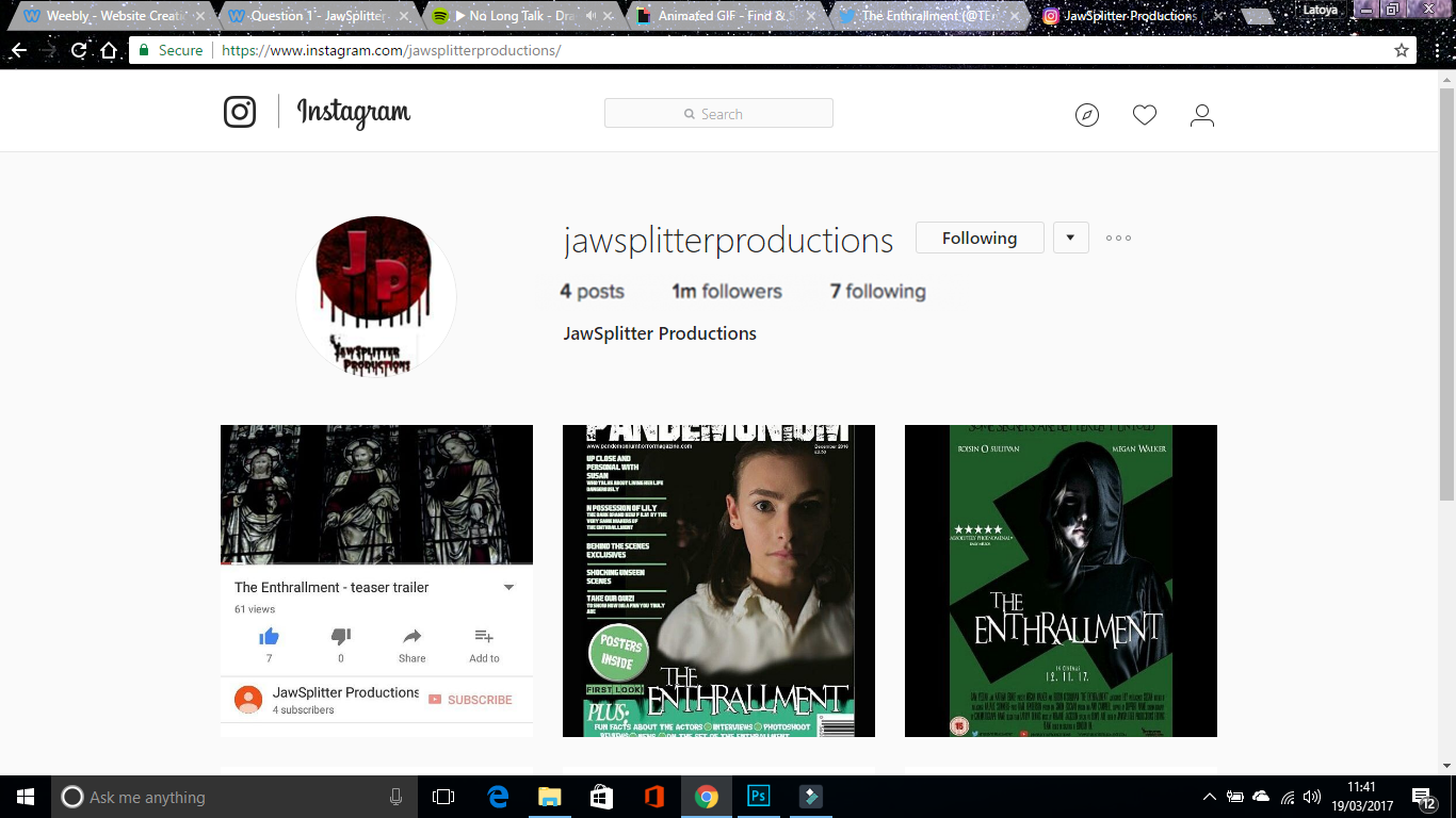
We have also used social networking sites such as Instagram to advertise our brand and products. This is effective as our target audience is mainly young audiences and these audiences tend to use social media alot. As shown in the image we have 1 million followers so we'll be able to advertise our brand easily.
We have also used our logo as our profile picture so our audience will be able to identify and recognise us. |
|
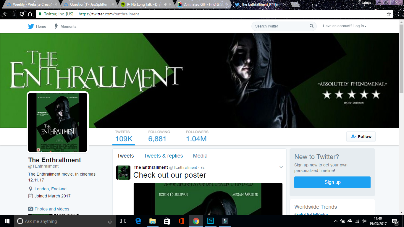
We have also used social networking sites such as Twitter to advertise our brand and products. This is effective as our target audience is mainly young audiences and these audiences tend to use social media alot. As shown in the image we have over 1 million followers so we'll be able to advertise our brand easily.
As shown in the image we have used our banner and our poster as our profile picture and header. This shows that we have used similar colours and typography so it'll be easier for audience to identify and recognise us. |
|
|
|
|
|
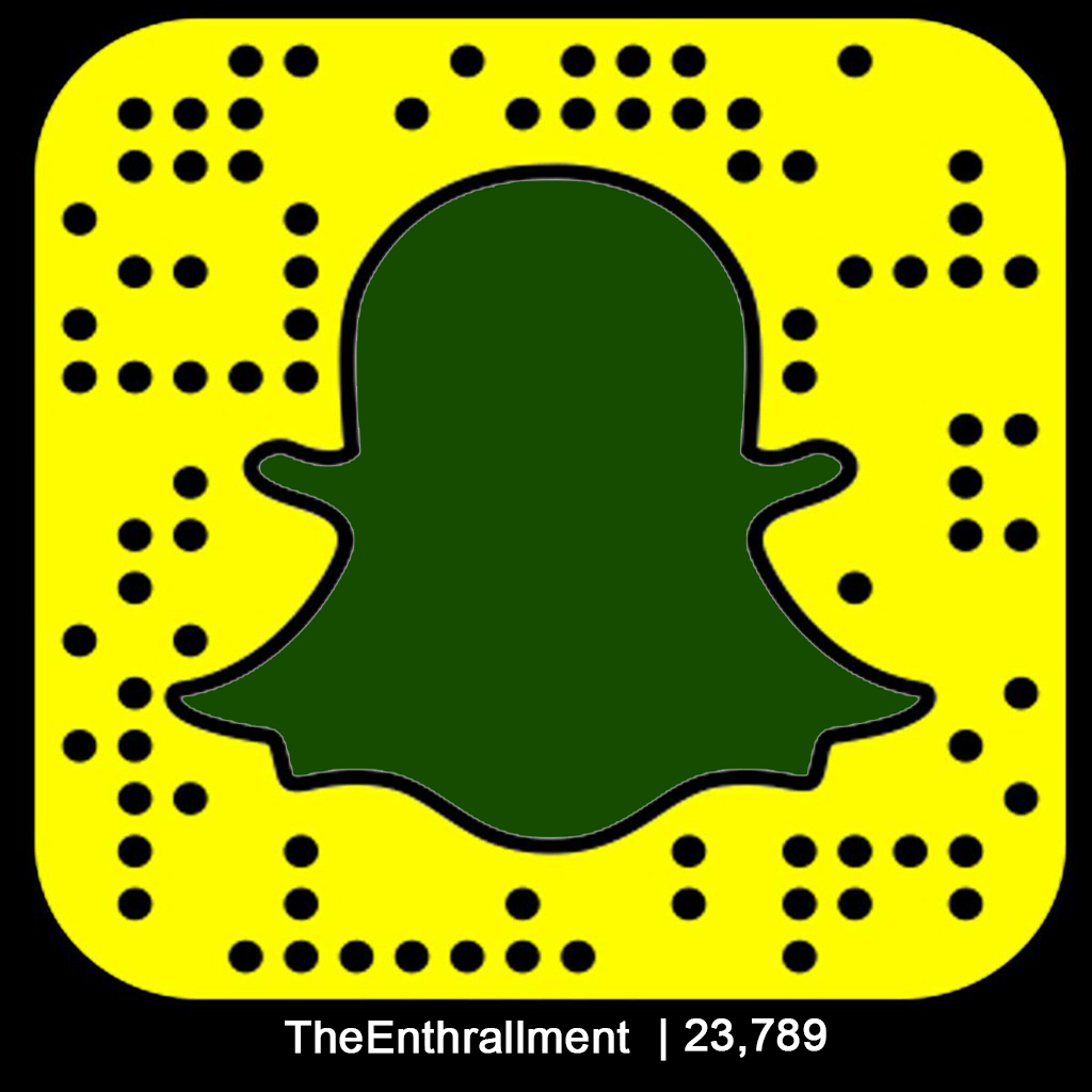
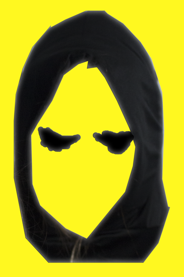
As shown in the images above we have also used snapchat to advertise our brand and film. We have done this by including one of the main colours of our brand on our snapchat code so that our audiences will be able to recognise us. We have also created a special snapchat filter in which our audiences will be able to use and take cool pictures to share with their friends and family. This is beneficial for our brand as more and more people will recognise our brand.
|
|
CONCLUSION
By Sam
All throughout our evaluation 2 page we looked at the many factors of our main and ancillary texts that would be effective in the synergy and marketing of them. There is much more to a trailer than being dark and somewhat creepy with a dark poster to match.
We were able to look at different forms of synergy in the marketing of our product due to it falling under the umbrella of mass media product. Our trailer is a form of digital media with the two ancillary texts falling under outdoor media. It was very important that the media reaches a mass audience in order to produce the most revenue possible so it was necessary to show all the different ways in which that could happen. There are lots of ways in which an audience can be exposed to a specific type of film, and the success a film has across different media technologies (Cross-Media Convergence) could be evaluate the good use of the main text (trailer) and ancillary texts (poster and magazine) to create the best promotion for them.
Although it's refreshing for audiences to see originality in the media that they consume it would be foolish for filmmakers not to look at other successful films, see where they went right and then apply the things that they have observed to their own products. In our case the main product was already completed so we chose to look at other products to see what we had done similarly to RMT. That way we could see if our film would bee in the same bracket as those that grossed millions at the box office. Franchises like Final Destination and Star Wars are prime examples of how main and ancillary texts were very effective.
At this point we had found and discussed what it was that made a film franchise successful and so the next step was to take apart our own main product and ancillary texts to see what different parts it was that made or would have theoretically made it a multi-million dollar franchise. The main factors that we looked at were things such as the font, colour schemes, characters used, character types, etc. It became clear to us that the repetitive use of the block colours for the campaign was important so continually using green and black in our products would make for the most recognizable franchise. It was clear to see that on a franchise like star wars they never once changed the font that was used to ensure that a continuity was carried over. It was seen that since we chose to keep these main factors consistent over the many ancillary texts that could be produced over the lifetime of a franchise the icons become recognizable to audience.
We then shifted over from the actual film franchise itself to the way that film companies choose to present themselves. The different measures that are taken can result in either a weak or strong brand which just from the way that people view or even remember a company can be the difference between millions in the film industry. Franchises with exciting narratives such as that of John Carter can be lost on an audience due to the generic and boring way that something is named or presented. Our film was successful as it is called 'The Enthrallment'. Simply from the name there is a sense of intrigued sparked in each person that hears it and to most from the name of the film it would seem that it is a horror film which is what it is. Simply put and further explored in other parts of this page our film aswell as the industry it's part of are successful.
Lastly we looked at the synergy possible in the many other platforms available to the same audience. With so many more platforms such as videogames, phone applications,etc it would be a waste not to use them. It was important for us to look at the different ways that the presentation of our product would need to change to be viewable on these platforms but also to pick as many platforms as possible while still making sure that they are available to the mass audience and even members of the same audience that are able to view the product on many different platforms to give the ffect of a 360 degree product.
