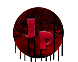
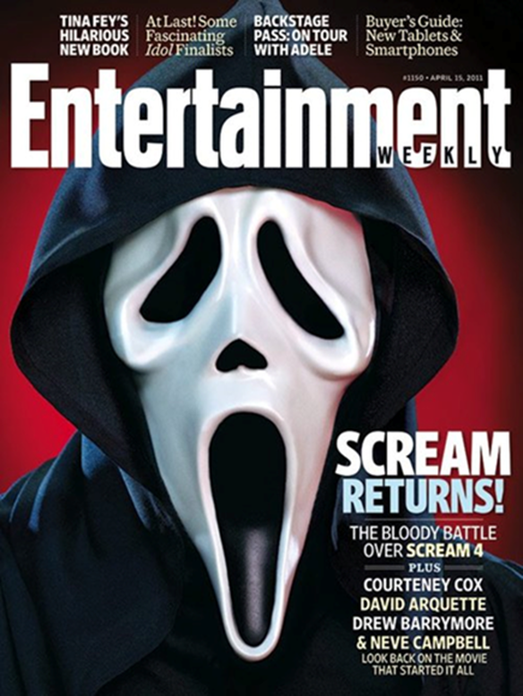
Scream 4
|
•Year: 2011
•By: Wes Craven •Info: Fourth instalment in the franchise. Iconic Slasher directed by Wes Craven •Synopsis: After the events that occurred in the previous instalment everything returns to normal for a number of years or so, until Sidney, the franchise’s recurring protagonist, gets a call from Ghostface stating that the game is not over yet, and that he’s going to kill every single person around her that she cares about until she’s the only one left. •Production company: Dimension Films •Cast: Neve Campbell, Courtney Cox, Lucy Hale, Drew Barrymore •Mise En Scene •Lighting: The lighting is slightly low key, with a spotlight shining on the person with the mask and the corners of the screen shrouded by darkness. •Setting: The setting of the picture is a phallic one. The background is partly black, and the only part that isn’t completely darkened is the blood-red part in the centre of the page. The fact that it covers the masked man’s head like a bloody halo could connote that he’s some sort of harbinger of death. •Costume: The cover model’s costume consists of a black gown with a black hood and a white mask. The black gown could connote some sort of madness that the person behind the mask could’ve fallen into and has clouded and darkened his mind, or it could connote death, and the white mask that looks like a person screaming could be one of reflection upon what he sees in himself inside of his victims – someone that is scared of life. •Props: the only prop used was the mask. It is white and is designed to look like someone screaming out of pure terror. •Camera shots: The picture was taken as a big close up as you can only see his body from the shoulders up. The fact that he’s addressing the audience could connote a secret message to the audience, but we’ll never know because his body language is neutral and unreadable. •Colours: The colours used in the picture are black and red. Black represents the shroud of confusion painted over the identity of Ghostface, and the red represents the bloody he will shed in the future. •Typography: All of the font on the cover page is white, which connotes an icy tone to the nature of the movie, usually the stock scenes, like when he is tormenting his victims before killing them. This is a usual convention as horror magazines usually colour their font in with a colour that represent the nature of their movie, like red for blood, or black for death. •Mood/Styling: The mood of the picture is very suspense-ridden, it feels like Ghostface could pounce out of the picture at any second with his body posture. The darkness connotes the evil side to humans lurking in the backgrounds of a human’s brain, and the red connoting the violence of men and their bloodlust when angered. •Key Conventions: Masthhead – the masthead is in the colour white, which makes the masthead stand out against the rest of the screen. The masthead is also the biggest piece of text on the screen, so it has to stand out so that we know it is the masthead. •The main cover line – is also white to continue the icy theme of the cover. |
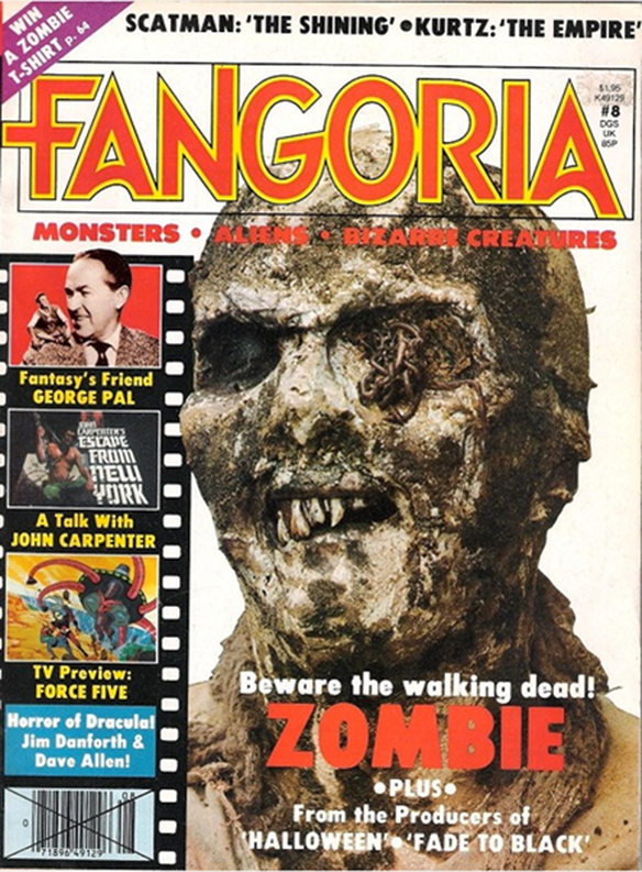
The Walking Dead
|
•Year: 1968
•By: George Romero •Info: Iconic Zombie movie on racial discrimination. •Synopsis: The nation is panicking because the dead have suddenly come back to life. The film follows a group of people who hide themselves in a farmhouse in an attempt to remain safe from these flesh eating monsters. •Production company: Image Ten •Cast: Duane Jones, Judith O'Dea, Karl Hardman •Mise En Scene •Lighting: The photos lighting is high key, and deliberately highlights every single feature of the zombie model on the front cover. •NVC: The zombie in the front cover is facing the camera, but its head is positioned in a manner that suggests it’s looking at something else in the distance – almost distractedly, like it’s found its next walking sack of meat to feast on. •Setting: The setting of the picture feels very distant. The background is a dirty white colour, connoting the zombie’s blank and 1-sided mindlessness; however the dirty brown towards the bottom connotes the rather disdainful, unwantedly disgusting side to the nature of the zombie – the part that only desires to feast on flesh. •Costume: The zombie’s clothing is dirty and ragged like it was pulled from a corpse underground. The actual head of the zombie looks authentically real. The skin is bumpy and decayed with insects cultivating in the left eye socket, like that of a zombie, and resembles more of the skeletal structure of the body, as if to connote that this is what all humans are deep down inside – mindless beings draining the life out of one another. •Camera shots: the shot used was a big close up. This is intentionally used to highlight the features of the zombie which is additionally assisted by the white background. The angle of the shot is used to portray the idea that the zombie has no idea the camera is in front of it and is focused on its next target. •Colours: For the picture, the colours used were white to connote the absentmindedness of humans, and brown to represent the decay/regression of society. •Typography: The magazine font is mostly red, to contrast the white and stand out – especially the masthead. The red could connote to the bloody brains that is eaten by the zombies. The white and red fonts work synchronically as the white is the informant text, whilst the red boldly outlines the key information, like in the main cover line. •Mood/Styling: The mood of the magazine art is depressing. The zombie is like a personification of the impending nothingness after the end of life, and the way the zombie is looking faraway connotes a sort of longing/remembrance of the life it once had. The white/dirty background also represents the white nothingness which the zombie returns from, but can never leave behind. •Key Conventions: The masthead – uses red font with a yellow outline to stand out boldly and clearly so the reader knows automatically what it is. •Main cover line – it uses white and red – white to explain the nature of the main story and red to outline what it is about. •Tag lines – side stories that include other information from other genres to entice a wider audience to read it. |
|
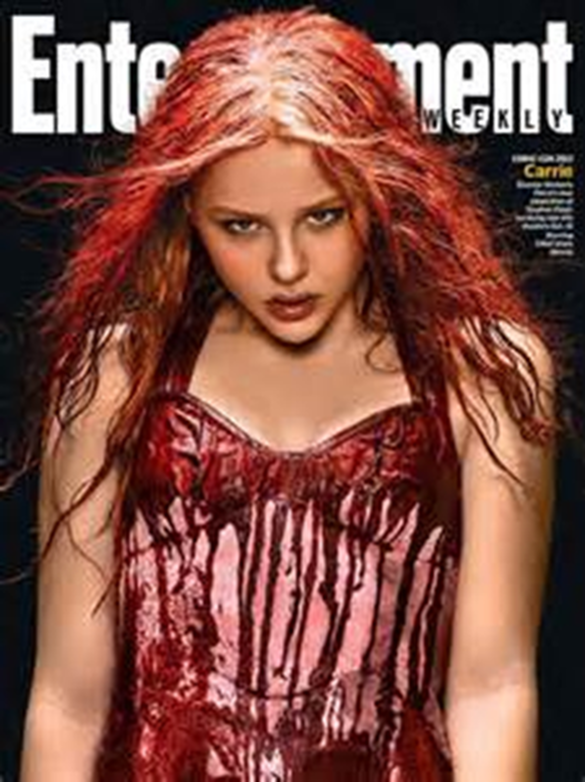
Carrie
|
•Year: 2013
•By: Kimberly Peirce •Info: Remake of 1976 Supernatural Horror directed by Brian De Palma •Synopsis: Carrie White, a shy girl bullied by her peers and abused by her deeply superstitious/religious mother, who unleashes telekinetic terror on her small town after being pushed too far at her senior prom. •Production company: Metro-Goldwyn-Mayer (MGM), Screen Gems, Misher Films •Cast: Chloë Grace Moretz, Julianne Moore, Gabriella Wilde •Mise en Scene •Lighting: The lighting on the girl is high key. •NVC: The girl is staring directly into the camera, addressing the audience. Her gaze seems dark and aggravated, like someone has deeply upset her. Her body posture looks like she could be holding something very dangerous, just ready to pounce. •Setting: Very dark. The girl is covered in a red substance, possibly blood, and the background is black, possibly connoting death. •Costume: hers is a dress, like she had gone to prom, but is stained by some red liquid, possibly blood, giving her a sort of demonic look as if she’s possessed and out looking for victims. •Typography: The Masthead is the biggest piece of writing on the page, and is in white to contrast the black background. However, this masthead is mostly covered by the main image in front of it, but this doesn’t matter, because if it’s covered it means that the masthead is well-known enough to be recognisable only by a few letters. Besides the masthead the piece of text is the main cover line, printed in small text next to the giant main image, detailing the movie briefly. •Mood/Styling: The mood of the front cover is eerie but sexual, the look on the girl’s face indicates a vengeful air, and the red liquid-covered dress showing a lot of skin connotes that maybe the girl has just hit puberty and it has changed her somehow. •Key Conventions: Masthead – this is to inform the reader what company is editing and creating these magazines. It is always the biggest piece of text on the front cover. •Main Cover Line – is used to outline the main article of the magazine. Is usually the second largest text on the front cover. •Main Image – Usually linked to the main cover line and main article. |
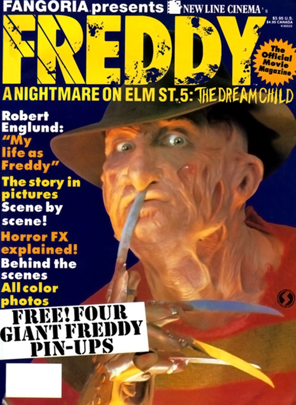
A nightmare on elm street: the dream child
|
•Year - 1989
•By - Wes Craven •Info - 5th instalment in the chilling Freddy Krueger franchise by award-winning Wes Craven •Synopsis - Freddy Krueger returns once again to terrorize the dreams of the remaining Dream Warriors, as well as those of a young woman who may know the way to defeat him for good. The pregnant Alice finds Freddy Krueger striking through the sleeping mind of her unborn child, hoping to be reborn into the real world. •Production companies - New Line Cinema, Heron Communications, Smart Egg Pictures •Cast - Robert Englund, Lisa Wilcox, Kelly Jo Minter •Mise en Scene •Lighting: Low-key, illuminates the subject of the photo and bounces off of his skin, imposing a shady and intimidating feeling. •NVC: The subject is directly addressing the audience, looking into the camera and putting one of his knife-like fingers to his lips as if to hush the audience and prevent them from screaming. •Setting: The background makes it seem as if the picture is set in the night time, with the flash light shining on the character’s face, giving the picture a low key lighting. •Costume: the costume is very creative, making his skin look as if it has been burned/melted ad this is his true form, the blades for hands also connoting a very phallic mood. •Typography: Unusually, the masthead is not the biggest piece of text on the page, but rather the main cover line is, saying the name of the character in the main image. On this front cover there is a barcode on the bottom left, just under the secondary coverline and the sub lines. |
|
